Have you ever stopped to consider how many blue logos you look at? From your social media icons on your phone to your trusted banks, blue is all over. And it’s not accidental. The color blue conveys trust, serenity, and dependability, which is why so many logos incorporate it.
Here, not only will color theory come into consideration. You will learn why light blue and dark blue logos are successful, see some famous brands using them, and how to combine colors with strong characters or other graphic elements.
There are helpful tips, design software, and plenty of ideas to get you started on creating a memorable logo, from a minimalist blue design to a chic multi-color one.


What the Color Blue Represents in Branding
Consider the previous blue-colored company logo that caught your eye. Did it feel trustworthy, relaxed, or possibly even robust? There is no error. Blue is recognized for evoking feelings in ways that most other hues do not.
This is how people usually feel when they have blue:
- Reliability and trustworthiness are essential for apps and banks.
- Calm and balance (why airlines depend on it)
- Smart thinking and reasoning (popular in technology)
- Stability and security (government agency ideal)
- Youthfulness and energy (especially when it’s a vivid blue)
- Strength and authority (darker colors are stronger)
Where it shows up most often:
Technology brands feature innovation; finance relies on solidity; healthcare emphasizes reassurance; and airlines hope you feel protected in the air. Governments even take blue colors for their logos. They use blue because it conveys order.
Psychologists have found blue to alleviate stress and improve concentration. No wonder it’s one of the most trusted core colors in branding.
Thus, your logo may make individuals feel one way or another. An upscale blue logo looks timeless, and contemporary design software enables one to quickly experiment with various alternatives.
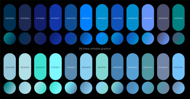
Shades of Blue and Their Psychological Impact
Not all blues are created equal. All colors have connotations, meanings, and optimal uses in branding. Below is how different shades of blue affect our perception of color, along with their hex codes for reference.
Sky Blue (#a1def5)
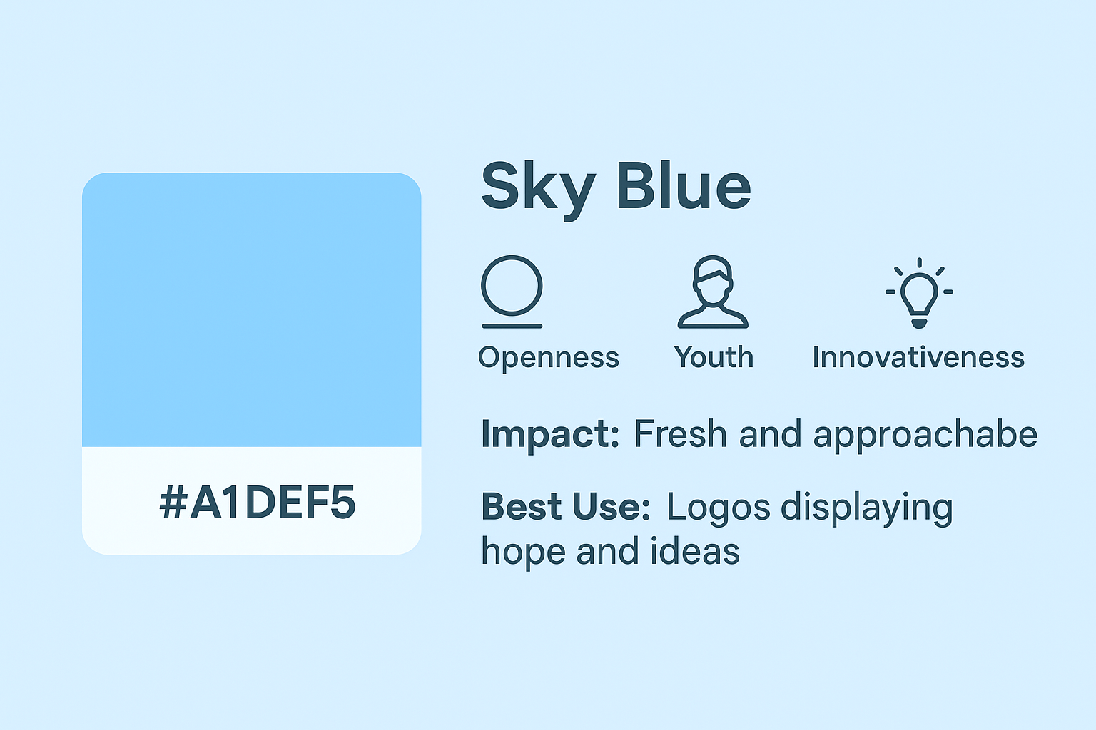
- Meaning: Displays openness, youth, and innovativeness.
- Impact: This lighter tone sounds fresh and approachable and is highly suitable for startups, lifestyle businesses, and businesses looking to appear easygoing.
- Best Use: Good for logos that wish to display hope and fresh ideas without appearing corporate.
Royal Blue (#0000ff)
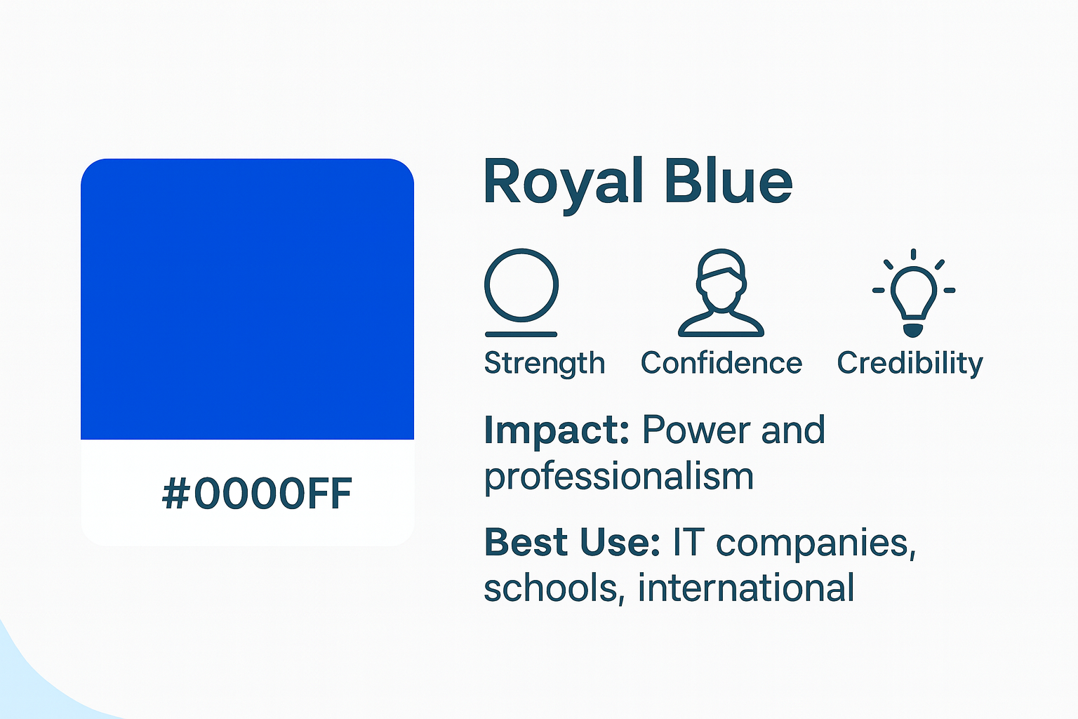
- Meaning: Concerned with strength, confidence, and having credibility.
- Impact: Royal blue will always feel like it’s connected to power and professionalism without ever becoming unfriendly.
- Best Use: This is best applied for IT companies, learning institutions, and international businesses that want to appear strong and credible.
Navy Blue (#000080)
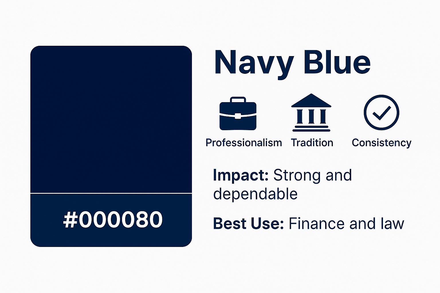
- Meaning: Suggests professionalism, tradition, and consistency.
- Impact: Dark tones symbolize strength and dependability; thus, they are used in businesses where reliability is critical.
- Best Use: Typically used in finance, governance, and law practices where trust and dependability are highly valued.
Turquoise (#5cc6ee)
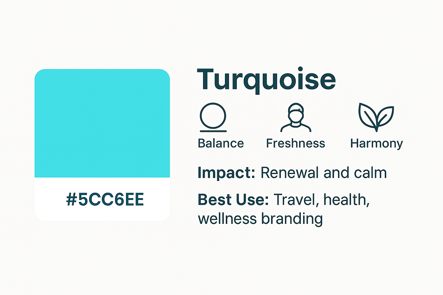
- Meaning: It exhibits balance, fresh colors, and harmony.
- Impact: Turquoise’s green undertones will create a feeling of renewal and calm. It’s also fresh and modern.
- Best Use: Turquoise is often used in travel, health, and wellness branding, where balance and clarity are required.
When creating your color scheme, pair these colors with neutral tones (like gray, black, or white) or contrasting hues (like yellow or orange) to create an eye-catching scheme. A careful pairing not only bolsters your look but also heightens the impact of your brand personality.
Top Blue Logos by Brand Attribute
Blue logos are not a blanket thing; different shades and types work with specific brand qualities, from trust to youth.
Here are some of the most recognizable blue logos and how their colors and designs align with specific brand qualities.
Reliability & Trust
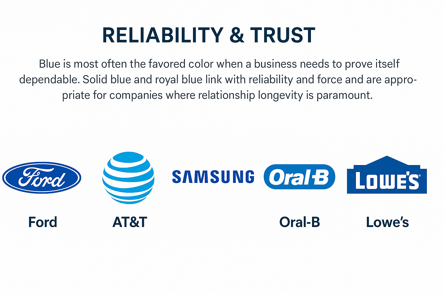
Blue is most often the favored color when a business needs to prove itself dependable. Solid blue and royal blue link with reliability and force and are appropriate for companies where relationship longevity is paramount.
- Ford: A royal blue letterform oval creates tradition and power.
- AT&T: A blue-toned circular shape featuring multiple shades of blue emphasizes global connectivity.
- Samsung: A deep, solid blue wordmark reinforces quality and innovation.
- Oral-B: Bright blue with straight lines reflects dental trust and precision.
- Lowe’s: A house-shaped blue design highlights home reliability.
Security & Stability
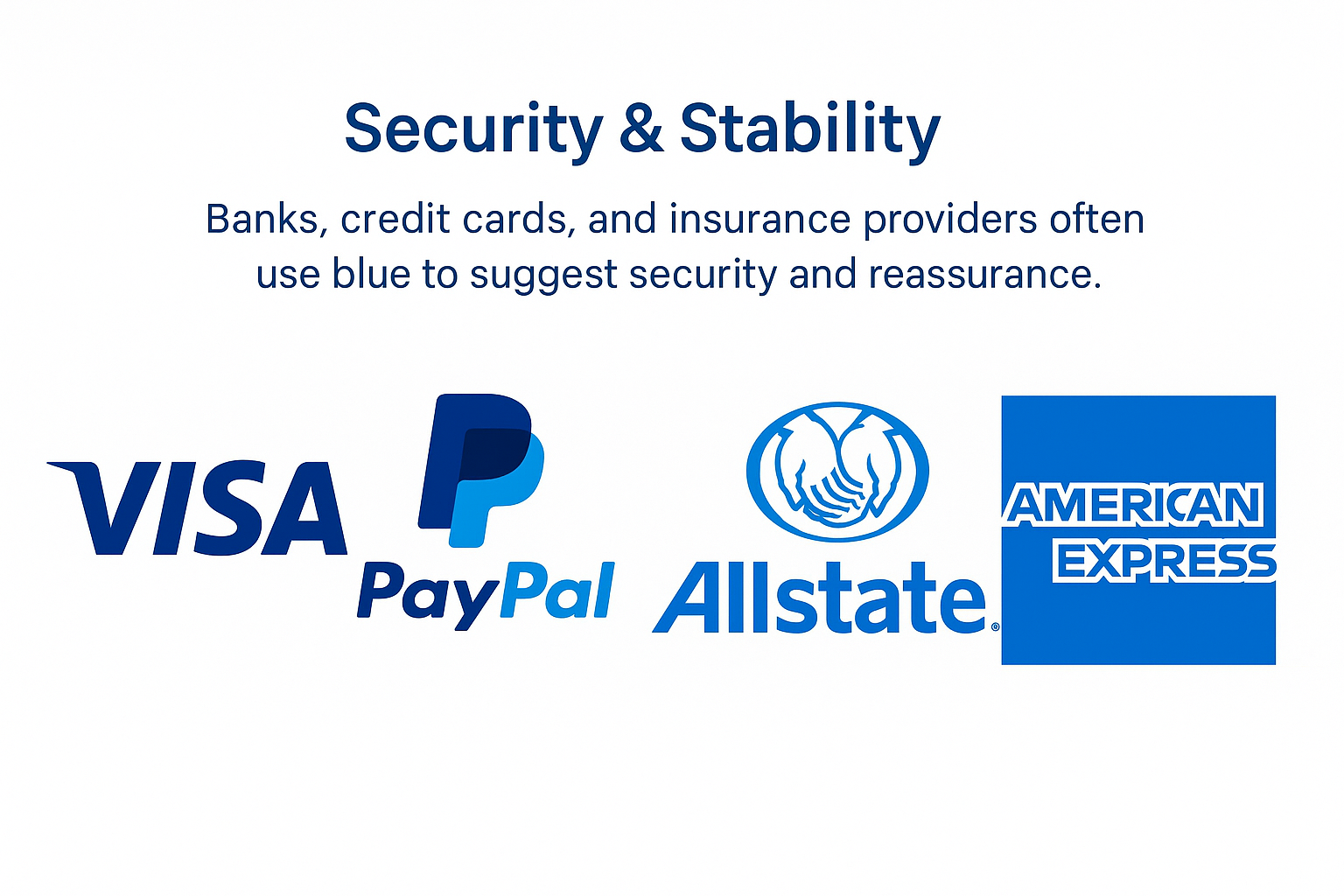
Banks, credit card companies, and insurance providers use blue because it conveys security and reassurance. Deeper tones in particular project authority, while balanced color combinations like blue with gold or white highlight clarity and prestige.
- Visa: A bold primary color blue paired with gold underlines global credibility.
- PayPal: Layered tones with stylized letters symbolize digital security.
- Allstate: A soft, vivid blue with protective hands conveys reassurance.
- American Express: A strong square in blue anchors financial reliability.
Calm & Comfort
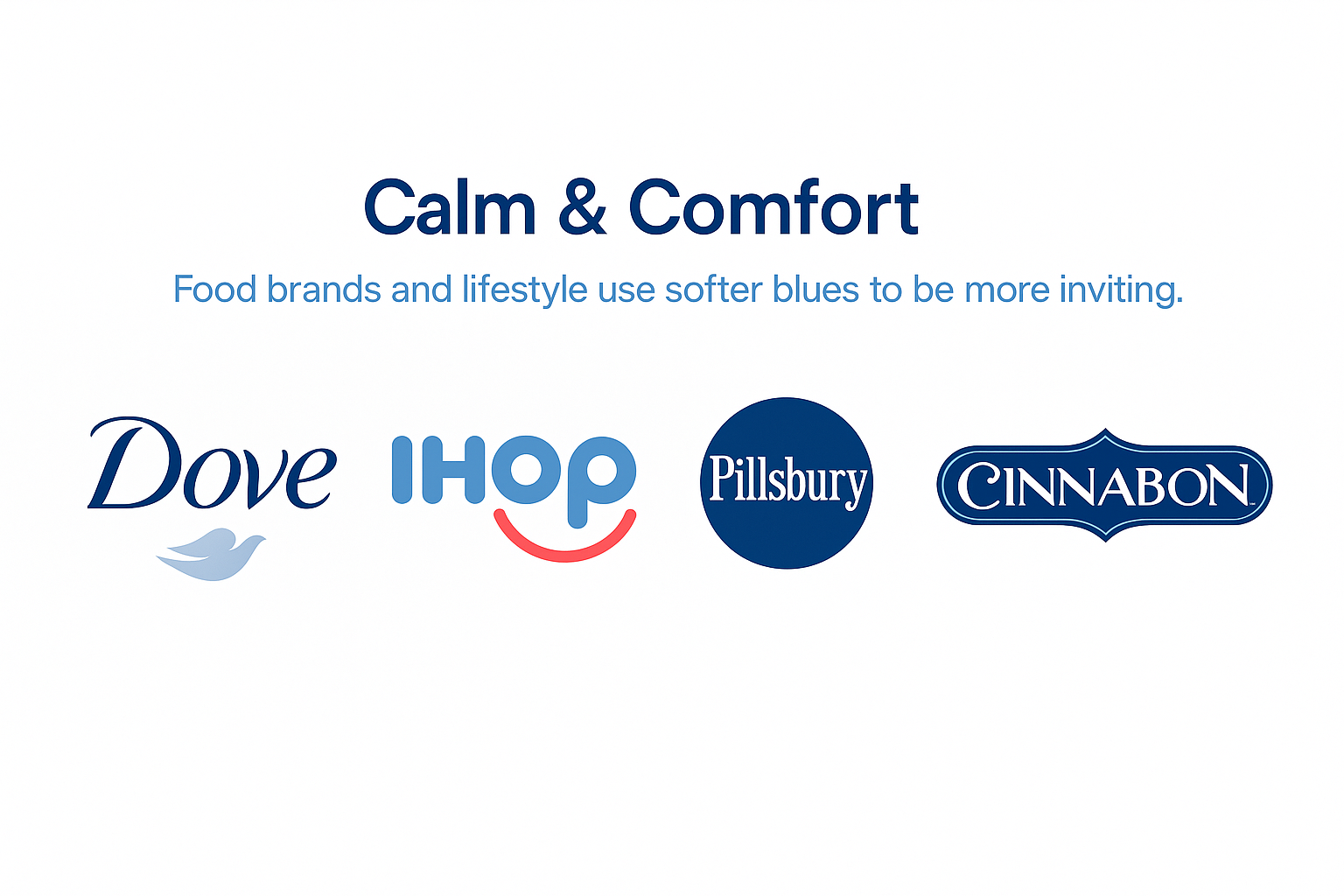
Food brands and lifestyle use softer blues to be more inviting. The light tone of sky blue emits friendliness, and conciliatory color combinations that pair blue with white or cream create warmth. These design choices make logos inviting, so clients feel at home, like family, and at ease.
- Dove: Gentle touches of blue with elegant type emphasize softness.
- IHOP: Sky blue paired with rounded fonts creates a cheerful vibe.
- Pillsbury: A dark blue seal feels homely and trustworthy.
- Cinnabon: Cozy color combinations of blue and cream evoke indulgence.
Power & Authority
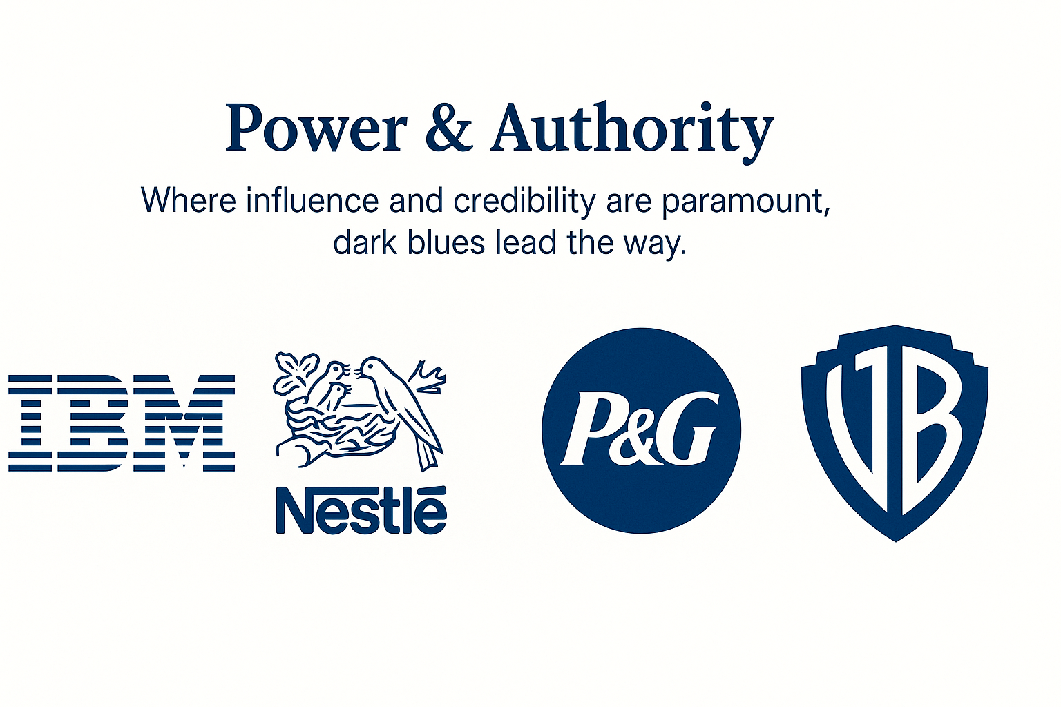
Where influence and credibility are of the utmost importance, dark blues lead the way. They speak to professionalism, legacy, and innovation all at once. By combining deep, solid blues with design elements such as straight lines and negative space, these brands communicate stability and power to the world.
- IBM: Striped straight lines in solid blue reflect corporate power.
- Nestlé: Dark blue paired with natural imagery balances care and authority.
- P&G: Circular logo with negative space showcases global leadership.
- Warner Bros.: A blue shield conveys tradition and dominance in entertainment.
Youthfulness & Tech
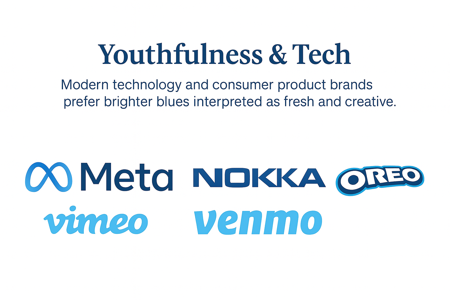
Modern technology and consumer product brands prefer brighter blues that are taken to be fresh and creative. Lighter colors, gradients, and playful lettering make logos appear innovative but also capitalize on blue’s trustworthiness.
- Meta: Gradient stylized letter logo signals innovation and community.
- Vimeo: A playful sky blue design reflects creativity in video sharing.
- Nokia: A bold, solid blue wordmark highlights youthful energy.
- Venmo: Friendly, vivid blue reinforces accessibility in payments.
- Oreo: Fun color combinations of blue and white capture youthful joy.
Color Combinations That Work With Blue
The perfect combination can either make or destroy a logo. Blue is strong on its own, but when paired with contrasting or complementary colors, it creates logos that grab attention and appeal to audiences on an emotional level.
- Blue + White: A classic combination that looks serene and traditional. Companies such as GE and Ford incorporate this combination to convey professionalism and trust.
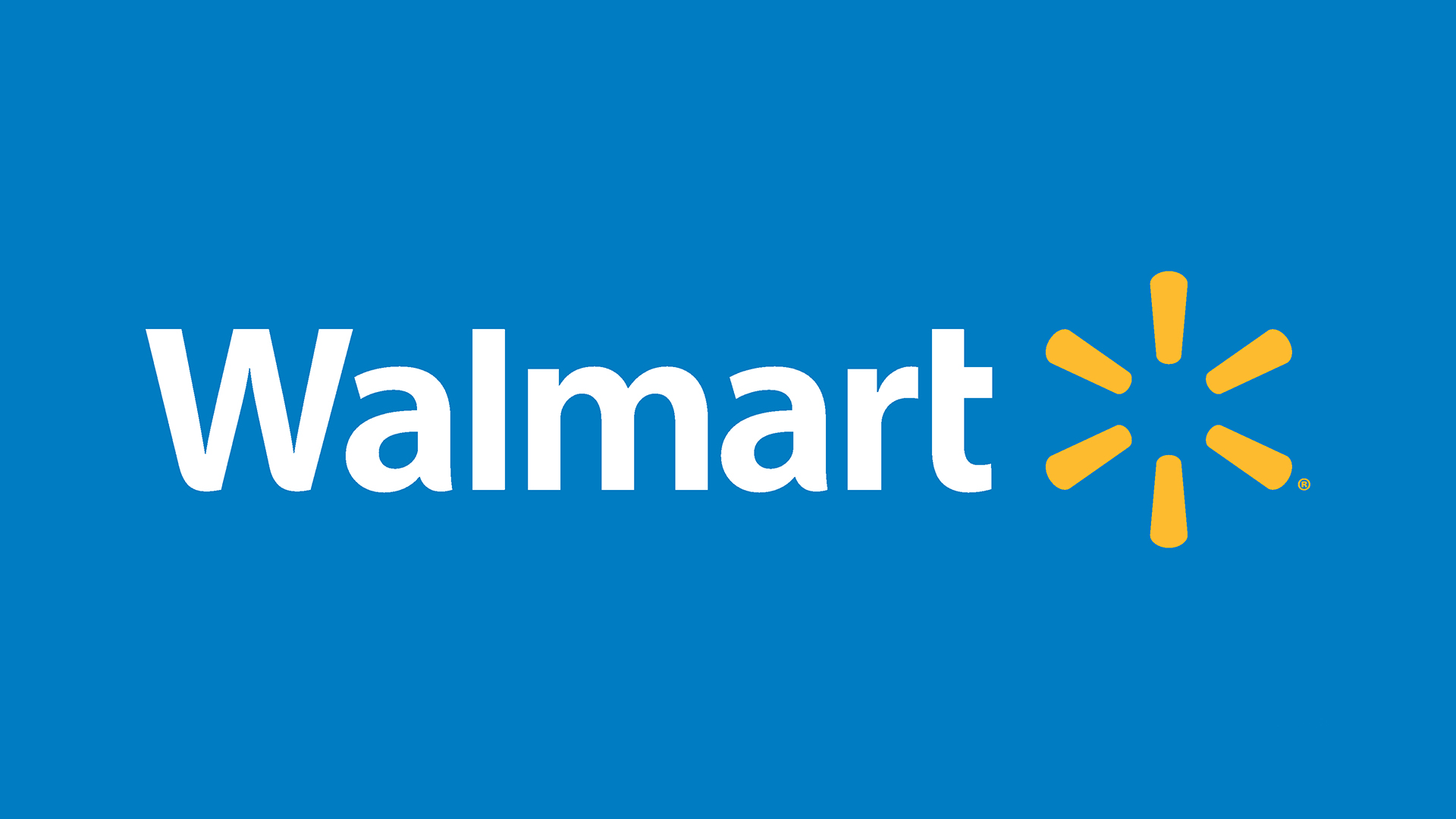
- Blue + Yellow: Strong and lively, this combination grabs attention and introduces warmth. Walmart and IKEA demonstrate how to make a brand seem friendly yet assertive.
- Blue + Orange: High-contrast combination that’s eye-catching. Used for complementary balance, it energizes logos without diminishing stability.
- Blue + Pink: Contemporary and youthful, this combination suits innovative or creative brands. Flickr employs it to emphasize playfulness and innovation.
- Blue + Turquoise: Clean and soft, the combination is ideal for well-being and food companies. Ocean Spray uses it to establish a fresh, natural brand.
- Blue-on-Blue: Piling various blue shades produces depth, unity, and versatility. It’s a great option for companies that need consistency, but also to visually stimulate.
Best Industries for Blue Logos
Blue appears across industries because it naturally reflects qualities like trust, reliability, and comfort. Here’s how it plays out in different sectors:
| Industry | Why Blue Works | Examples |
| Finance | Projects trust, security, and stability in money management. | Barclays, Bank of Hawaii |
| Tech | Signals intelligence, professionalism, and innovation. | Dell, IBM |
| Airlines | Creates a sense of reliability, safety, and calm for travelers. | United, British Airways |
| Food | Conveys comfort, family-friendliness, and approachability. | Pillsbury, Oreo |
| Retail | Suggests affordability, accessibility, and everyday reliability. | Walmart, Aldi |
Whether in finance, retail, or even food, blue logos adapt to industry needs while always reinforcing trust and recognition.
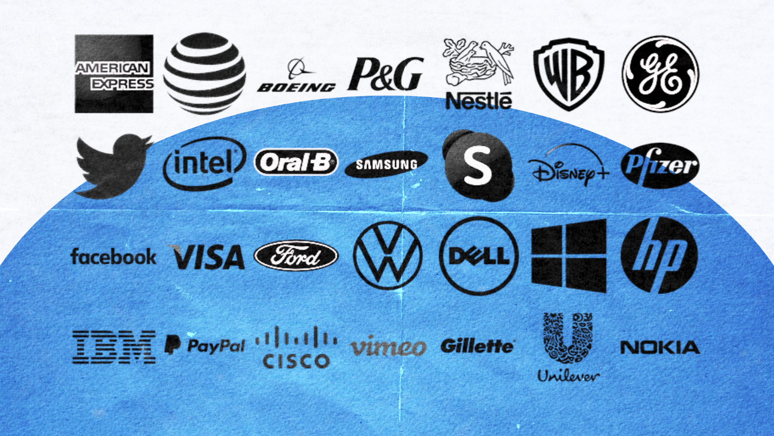
Famous Blue Logos: 25+ Global Examples
If you’re searching for Famous Blue Logos, here’s a curated list of global icons and niche brands that prove just how versatile blue can be in logo design.
Facebook (Meta)- Solid blue stylized lettering highlights connectivity and community.
![]()
IBM – Striped straight lines in deep blue represent innovation and corporate strength.
![]()
Twitter (legacy bird) – A sky blue bird that became a universal symbol of communication.
![]()
LinkedIn – The blue square mark communicates trust and professional growth.
![]()
Ford – Classic royal blue oval emphasizes heritage and reliability.
![]()
General Electric (GE) – White-on-blue circular outline symbolizes industrial trust and innovation.
![]()
Samsung – Dark solid blue type signals quality and global reach.
![]()
Dell – Blue with a tilted stylized letter reflects creativity and problem-solving.
![]()
PayPal – Overlapping blue color combinations reinforce digital trust.
![]()
Visa – Strong primary color blue with gold accents conveys security and credibility.
![]()
American Express – A vivid blue square projects financial reliability.
![]()
Allstate – Light blue with protective hands conveys reassurance and safety.
![]()
United Airlines – A circular outline globe in dark blue reflects global reach and calm.
British Airways – Navy blue paired with red highlights professionalism and national pride.
Barclays – Bold blue eagle conveys strength, tradition, and security.
![]()
Bank of Hawaii – Vibrant tropical blue emphasizes trust and regional identity.
![]()
Dove – Soft blue with elegant type communicates gentleness and care.
![]()
Pillsbury – A dark blue seal that evokes homeliness and family comfort.
![]()
Oreo – Playful blue-and-white color combinations showcase youthful energy.
![]()
Cinnabon – Rich blues with cream tones suggest comfort and indulgence.
![]()
Walmart – Blue lettering with yellow spark balances trust and affordability.
Aldi – Layered shades of blue with orange accents reflect budget-friendly appeal.
![]()
Vimeo – A sky blue wordmark that feels creative and approachable.
![]()
Venmo – Friendly, vivid blue logo highlights accessibility and simplicity.
![]()
Ocean Spray – Blue with turquoise accents conveys freshness and a sense of natural balance.
![]()
Skype – Rounded sky blue bubble design signals friendliness and ease of use.
![]()
HP (Hewlett-Packard) – Blue circle with stylized lettering represents consistency and innovation.
![]()
These Famous Blue Logos show that no matter the industry—tech, finance, food, or retail—blue adapts seamlessly while maintaining its universal appeal.
Create Your Own Blue Logo: Tools & Resources
Designing a blue logo has never been easier thanks to modern tools and inspiration platforms that help you explore shades, styles, and layouts. Here are some of the best places to start:
AI Logo Makers
- Looka – Generate professional logos with customizable color palettes in just a few clicks.
- Wix Logo Maker – Offers guided logo creation for small businesses.
- 99designs – Connects you with designers for custom blue logo concepts.
Free Inspiration Libraries
- Behance – Browse creative portfolios and stylized lettering examples.
- Pinterest – Save collections of Famous Blue Logos and design ideas.
- LogoFav – A curated gallery of logos to spark new directions.
Best Practices for Blue Logos
- Simplicity: Avoid clutter; clean designs are more memorable.
- Readability: Ensure fonts and shapes are clear at any size.
- Color harmony: Pair blue with complementary color combinations for balance.
- Meaning behind your shade: Choose between sky blue, royal blue, or navy blue based on your brand’s personality.
Tips for Designing with Blue
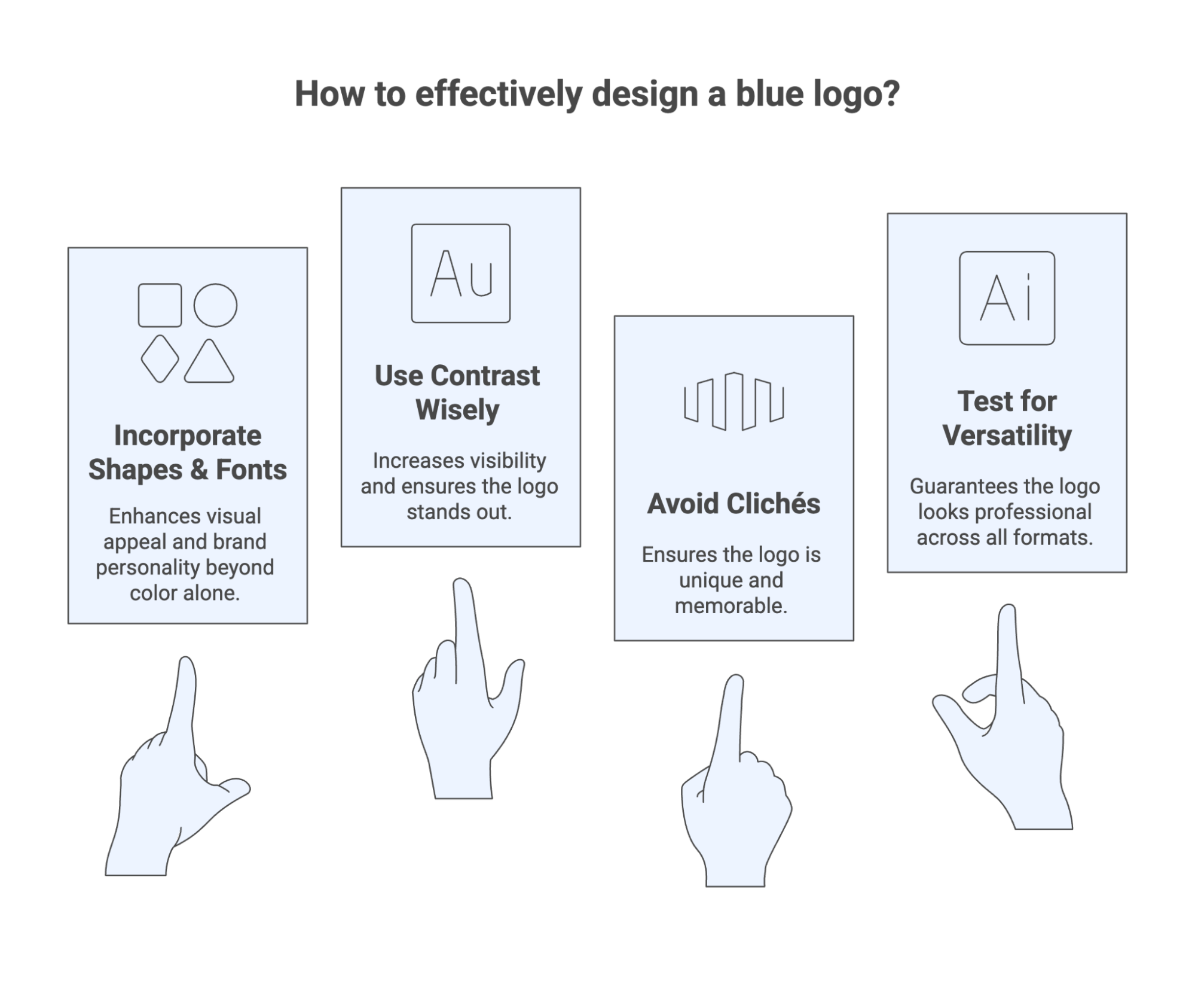
Blue design provides plenty of opportunities, yet making an impression involves something beyond choosing the right color. Advice below will guide you in better decisions that create your logo distinguished and successful..
Don’t Rely Only on Color
Blue is vital, though it cannot appear on its own in the design. You will want shapes, fonts, or even a smart vertical line to make your layout look good and balanced. Design your logo as though it were literally a glimpse into your brand’s personality, not just its color usage.
Use Contrast Wisely
Whenever possible, light blue alongside darker colors or blacks looks good visually. Contrast makes logos more noticeable; without it, they’re particularly hard to see on smartphone screens. A test with various backgrounds ensures your design will look good in all circumstances.
Avoid Common Clichés
Quite a number of corporate brands employ plain blue logos that resemble one another. Make it distinct by incorporating innovative use of letters, playful shapes, or vigorous colors. Even large telephone corporations have modified their logos to distinguish themselves.
Always Test for Versatility
A good logo will reproduce without difficulty in all formats. Printing it in grayscale or B&W determines whether it looks good without color. Flexibility keeps your logo looking professional and uniform throughout.