Let’s say you’ve put in the work. You have optimized SEO content, compelling landing pages, and well-crafted email campaigns. But if conversions are still falling short, the issue might not be your content. It could be your call to action.
A CTA is where your content fulfills its purpose. It’s the moment when curiosity becomes a click—and that click becomes a customer.
So, what makes a call to action truly effective?
In this guide, we’ll break down how to craft CTAs that actually convert. You’ll get real-world examples and practical insights you can apply to your digital marketing strategy right away.
We’ll cover CTA tactics for landing pages, ecommerce sites, and even YouTube and Facebook ads. Plus, you’ll find actionable tips and smart strategies to increase conversions—no gimmicks, just what works.
What Is a Call to Action?
To put it simply, a Call to Action, or mostly written as CTA, is a marketing term for any prompt that encourages someone in your target audience to take the next step. It could show up as a button, a short message, a pop-up banner, or even something spoken in a video. You see them constantly—phrases like “Join Today,” “Get Started,” or “Free Trial.” Chances are, you’ve already clicked one without even thinking about it.
But the real magic of a call to action isn’t in the words alone—it’s in what comes after. It marks the shift from someone just looking… to someone taking the next step.
A well-crafted CTA speaks directly to your target audience, matches the tone of your marketing, and leads people toward a clear, specific action—like joining your email list, downloading a resource, or making a purchase.
Bottom line? A strong CTA is one of the easiest, most effective ways to guide behavior and drive real results across your website and campaigns.
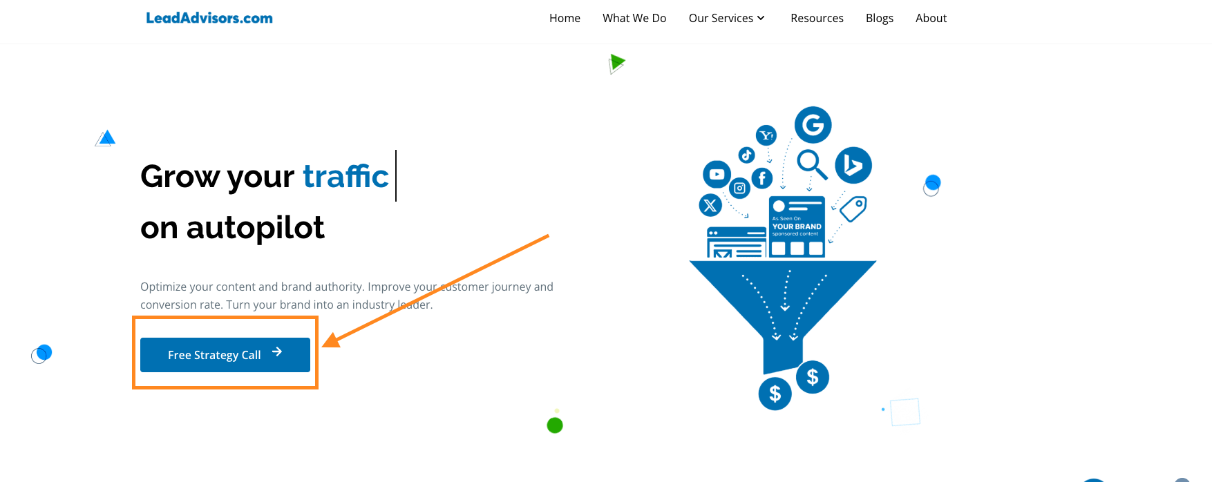
Key Elements of a High-Converting CTA Button
A high-converting call to action button is more than just clickable—it’s clear, helpful, and conversion-ready. Here’s what separates good call design from the best CTAs:
- Clear CTA Copy – Use action verbs and action words like “Get,” “Download,” “Start,” or “Subscribe Today.” Make sure your CTA copy reflects the outcome, not just the action.
- Strong Visual Design—Action buttons must stand out against the rest of the page. Use contrasting colors and clean fonts.
- Placement on the Page – Place CTAs near key sections on your website, especially on your home page, product pages, and forms.
- Low Friction – Avoid asking for too much too soon. Don’t ask a potential customer to commit unless they’re ready. Use secondary CTAs for softer actions.
- Value-Oriented – Connect the CTA to a benefit. Instead of “Submit,” try “Get My Free Plan,” which reinforces your value proposition.
When a CTA is well crafted, it drives user behavior and supports your broader marketing campaign, especially when paired with smart conversion funnel optimization.
What Makes a Great CTA Button for Best Online Results?
Let’s talk about what separates a good CTA from a great one. You don’t need flashy colors or clever rhymes—you need clarity, intent, and timing.
A strong CTA button gets straight to the point. It says what it needs to say, sits where it needs to be, and makes taking action feel like the obvious next step.
What makes it great?
- Clear, direct language – Action words like “Get,” “Try,” or “Book” tell people what’s coming.
- Benefit-focused copy – Don’t just say “Sign Up.” Try “Sign Up to Save Your Spot” or “Start Free to See How It Works.”
- Contrast and visibility – The button shouldn’t blend in. It needs to pop visually and be easy to find.
- Logical placement – Place it where people are ready to act—after value has been delivered, not before.
A CTA is like a green light. Make sure it feels like a smooth ‘go’—not a pause for confusion.
What Not to Do in Your CTA
Let’s be honest—there are a lot of ways a CTA can go wrong. And if your call to action confuses people, slows them down, or feels irrelevant, chances are they’ll skip it.
Common mistakes to avoid:
- Being too vague – CTAs like “Click Here” or “Submit” don’t give people a reason to click. A clear CTA tells them what they’ll get.
- Using multiple CTAs that compete – It’s okay to give options, but if your landing page has five different action buttons, you’re probably creating decision fatigue.
- Forgetting context – Your CTA should match the message and the moment. If your email campaign is about saving time, your CTA should reflect that benefit.
- Missing urgency – Sometimes, people just need a little nudge. Phrases like “Limited Offer” or “Sale Ends Tonight” can encourage that immediate response.
The goal of a CTA isn’t just to get a click. It’s to move someone further into your marketing campaign with intention and confidence.
How to Measure CTA Success
To determine whether your CTAs are working, you need to track how they impact conversions. Here’s how:
- Click-Through Rate (CTR) – The number of people who clicked your CTA versus how many saw it.
- Form Completions – Are people filling out the forms connected to your CTA?
- Conversion Rates – How many users completed the specific action, such as making a purchase or joining your email list?
- A/B Testing – Try different call–to–action copies, placements, or colors to see what drives better results.
Use tools like Google Analytics, heatmaps, and UTM best practices to track user behavior and improve online results over time.
When to Use Secondary CTAs
If your primary CTA feels too bold for some users, offer a secondary CTA that feels lighter or more informative. This is especially useful for ecommerce brands or services with long sales cycles.
For example:
- Primary CTA: “Sign Up for a Free Trial”
- Secondary CTA: “Watch a Quick Demo”
This approach keeps your marketing materials flexible and can help increase conversions by offering more than one entry point.
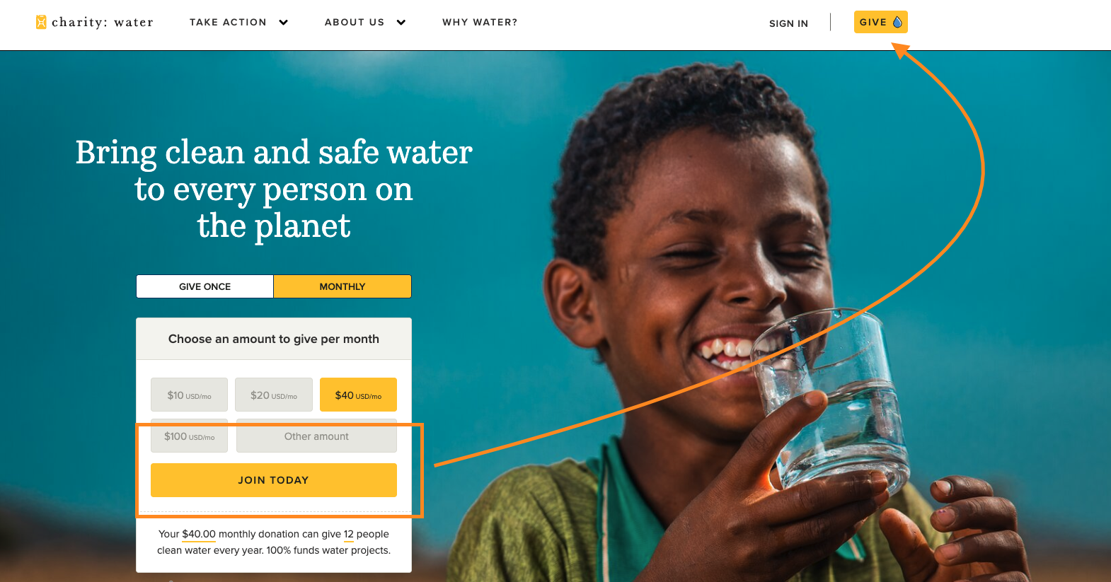
Landing Pages Call to Action Examples
Landing pages and web pages need fast, direct CTAs that reduce friction and speak to the visitor’s intent. Your CTA should reinforce the value proposition and appear early and often.
Examples:
- “Try Free for 14 Days” – Popular with SaaS companies looking to lower the barrier to entry.
- “Get Instant Access” – Works well for gated content or downloadable marketing materials.
- “See It in Action” – A strong choice if you’re promoting a video demo or product walk-through.
For more insight, see our guide on how to create a landing page that converts.
E-commerce Call to Action Examples
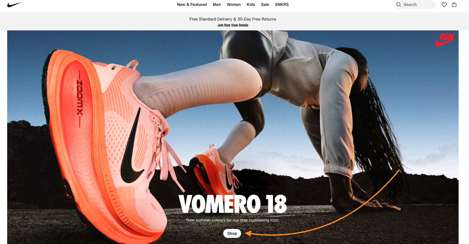
Ecommerce brands thrive on clarity and quick action. The goal is to make it easy for shoppers to move forward without second-guessing.
Here are a few go-to CTAs that do just that:
- Add to Cart – You’ll want this on both product and category pages so shoppers can keep browsing without losing their place.
- Buy Now – Best used when you’re trying to make quick decisions—great for flash sales or limited stock.
- Apply Discount – Handy for drawing attention to deals or nudging customers to spend a little more with a promo code.
You’ll also want to keep your pages healthy with this eCommerce SEO audit guide or improve conversion paths with a content audit for better ecommerce conversions.
Whether it’s the holiday season or a three-day weekend campaign, ecommerce brands should always match their call to action copy with intent, urgency, and seasonality. If you’re staying ahead of the curve, keeping up with the future of ecommerce trends can also help guide how you structure those CTAs.
Facebook Ads & Instagram Call to Action Examples
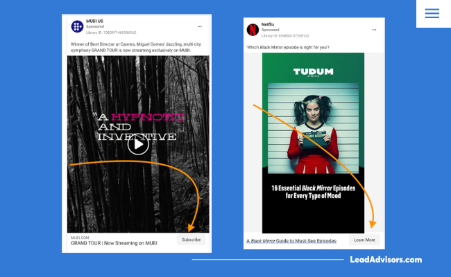
Social platforms like Facebook and Instagram offer built-in CTA buttons that, when used the right way, can really drive engagement. Here are a few you’ll commonly see:
- Shop Today – Ideal for limited-time deals, flash sales, or clearing out inventory.
- Sign Up – Works well for building your email list, promoting a newsletter, or getting people on a waitlist.
- Send Message – Opens the door for direct conversations with potential customers, making it easy to answer questions or build trust.
Pair these with strong ad copy and visuals to provoke emotion and deliver an immediate response. And if you’re working with limited ad spend, explore these tips on how to run successful Google Ads on a small budget.
Google Ads Call to Action Examples
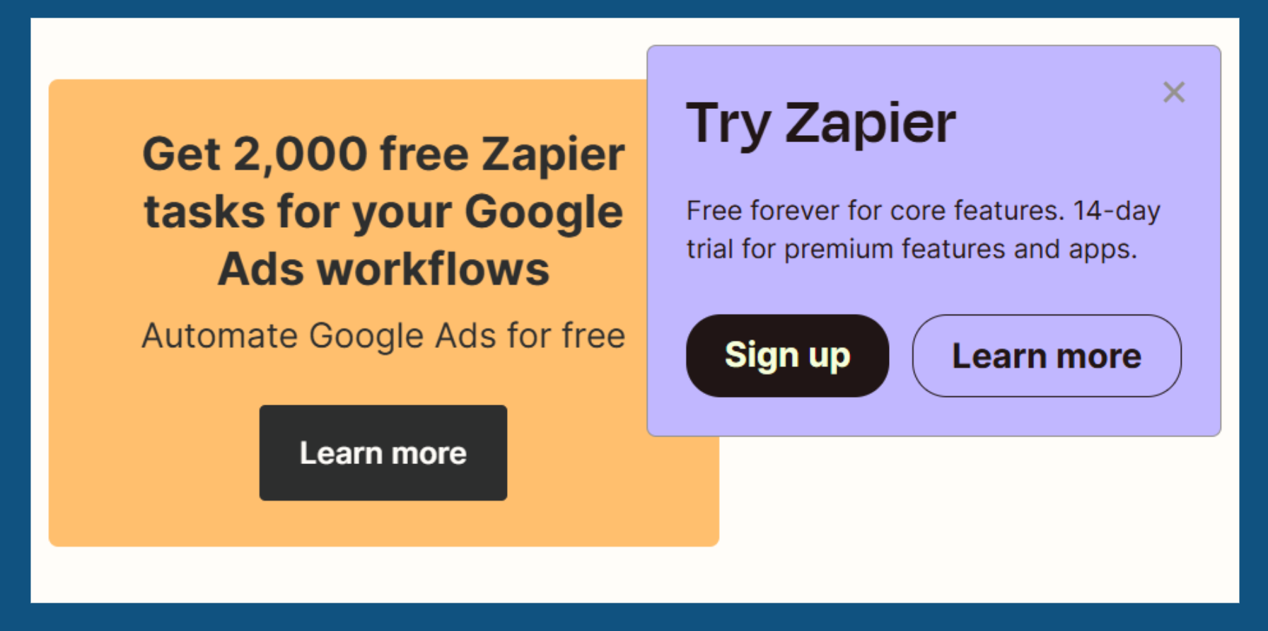
A strong Google ad CTA needs to be clear, convincing, and closely connected to your ad message. It should guide users toward a specific action and align with what they’re actually searching for.
Some effective examples:
- Get a Free Quote Today – Great for service-based businesses looking to capture interest quickly.
- Schedule a Call – Common among consultants or SaaS companies offering demos or personalized help.
- Download the Guide – Perfect for lead magnets or gated content that offers real value up front.
You’ll usually see these CTAs in ad headlines, sitelinks, or as part of extension copy. To really make them work, match the CTA to both the user’s intent and their stage in the buying journey.
And if you’re in tech, B2B, or subscription-based services, check out these SaaS SEO strategies to amplify those results even more.
Top of Funnel (Awareness)
- “Learn More” on blog posts
- “Get the Guide” on educational landing pages
Middle of Funnel (Consideration)
- “Compare Features” on solution pages
- “View Case Studies” in targeted campaigns
Bottom of Funnel (Decision)
- “Sign Up Today” on your pricing page
- “Schedule a Free Consultation” in a sales-focused Facebook ad
If you’re unsure where to direct traffic, this comparison of website vs. landing page can help clarify your CTA approach.
YouTube Call to Action Examples
CTAs on YouTube can appear in end screens, overlays, pinned comments, or even verbally within the video itself. They’re most effective when they align with your video’s purpose and provoke enthusiasm or curiosity.
Examples
- “Watch the Full Tutorial” – Keeps viewers engaged and moves them to your next piece of content.
- “Subscribe Today” – Helps grow your audience and stay connected.
- “Download the Free Template” – Great for lead generation via educational content.
When your CTAs are consistent across your channel and website, they can support larger digital marketing goals and drive action beyond the video itself.
Event and Webinar CTAs
CTAs for events and webinars need to feel urgent and exclusive. They’re often short-lived campaigns, so clarity and timing matter.
Examples
- “Reserve Your Spot” – Common for live online events or Zoom-based training.
- “Register for the Webinar” – Good for thought leadership or educational content.
- “Save My Seat” – Feels more conversational and exclusive.
Emotional and Psychological Triggers in CTAs
The best calls to action do more than just chase clicks—they spark a feeling. Whether it’s a sense of urgency, a fear of missing out, or just plain curiosity, the right CTA gets people to care enough to act.
Examples
- “Last Chance to Save” – Creates urgency.
- “Only 7 Spots Left” – Sparks FOMO.
- “Unlock Your Access” – Appeals to curiosity.
Personalized and Dynamic CTAs
Personalized CTAs use behavior, location, or past activity to create more relevant prompts.
Examples
- “Welcome Back, Alex” – Greets returning users.
- “Finish Your Free Trial Signup” – Nudges users who didn’t complete a form.
- “Recommended for You” – Shows curated offers or other posts.
CTA Formats: Beyond the Button
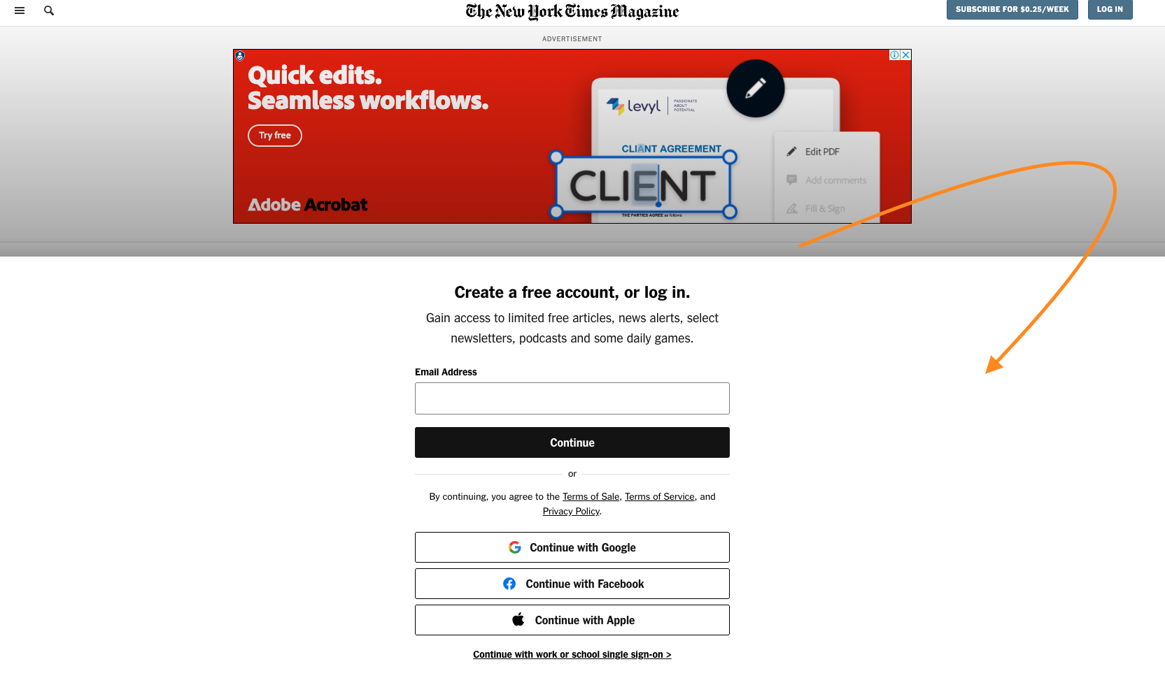
Not every CTA needs to be a button. CTAs can appear in banners, pop-ups, exit-intent modals, slide-ins, or even inline text.
Formats to Try
- Inline Text CTA: “Want more insights? Download the full report.”
- Slide-In CTA: Appears mid-scroll on blogs.
- Exit Popup CTA: “Wait! Get 10% Off Before You Go.”
Industry-Specific CTA Examples
Industry-specific CTAs help tailor your marketing message to your business model.
Real Estate
- Generate Real Estate Leads
- “Schedule a Home Tour”
- “Get Pre-Approved Today”
Education

- “Apply Now for Fall 2025”
- “Take a Virtual Campus Tour”
SaaS
- “Start Free Trial”
- “Book a Live Demo”
For more general guidance, here are 6 ways to generate leads for your business that can be adapted across industries.
CTA Placement Strategies
Even the best call-to-action copy won’t perform if it’s in the wrong spot. CTA placement should align with how users move through your content.
Best Practices:
- Above the Fold: Place your primary CTA in the hero section of your landing page.
- After Value Is Delivered: In blogs or product pages, use CTAs after the core content or solution is revealed.
- Sticky CTAs: Useful on mobile or long-scroll pages.
If you’re optimizing conversion paths, don’t miss our full breakdown on conversion funnel optimization.
Use Original Call to Action Examples on Your Website
If you’re copying CTAs from competitors or templates, you’re missing an opportunity to create something memorable. These are crafted with your brand voice and context in mind.
Try using language that reflects what your audience wants to achieve:
- Instead of “Submit”, say “Send Me My Free Strategy Guide”
- Instead of “Join”, try “Get Instant Access to Exclusive Tools”
These well-crafted calls feel more personal and encourage specific action. Whether you’re trying to provoke emotion, enthusiasm, or urgency, the key is clarity and connection.
Quick Wins from CTA Experiments
Sometimes a single word swap or design tweak can dramatically boost performance. Here are some real-world improvements:
- A tech company replaced “Book a Demo” with “Get Started”
- A nonprofit boosted donations by 22% with a CTA that included “Time-Sensitive Match” during the Christmas season
- Adding urgency phrases like “Sale Ends Tonight”
These aren’t secret formulas—they’re examples of listening to your audience and adjusting your messaging to prompt a better, faster response. Small tests, just like a proper spam score reduction strategy, can have long-term results.
Final Thoughts: No Secret Formulas, Just Strategic CTAs That Work
The right call to action can be the difference between a curious visitor and a paying customer. From button labels to ad copy, every detail contributes to guiding your audience toward the desired action.
A great call doesn’t just aim for clicks, it creates momentum. An effective CTA connects your message with what your target audience truly wants. It builds trust, clarifies the next steps, and helps users feel confident about moving forward.
Whether you’re writing copy for a landing page, designing a form, or setting up an ad, never underestimate the power of compelling CTAs. Even small adjustments, like changing a word or shifting the placement, can lead to measurable results.
A truly effective CTA is more than a design element. It’s a strategic tool that turns interest into action and helps move your audience through the funnel.
Need help crafting a great call that speaks directly to your audience? Focus on the value you offer and make that the core of your message.