Let’s be honest – even if you have an amazing product or service, if no one is interested, your business isn’t growing.
That’s where lead generation can be useful. It’s just inviting and persuading people to raise their hand and say, “Hey, I’m interested!” — and then how to keep the conversation going. And one of the simplest, most effective ways to accomplish that? Lead generation forms.
You see them everywhere: a form on a landing page requesting your name and email, a pop-up offering a free download, or a short survey for a discount code. These lead capture forms help businesses gather a lead’s contact information if they are interested in what you have to offer, making it that much easier for them to make a sale and earn more money.
In this guide, we’re breaking down exactly what these lead forms are, what they look like in action (with real lead generation form examples), and how you can create ones that actually work. We’ll also go over best practices and the tools that make it all much easier.
What Is a Lead Generation Form?
Let’s say someone stumbles onto your website. They’re browsing, skimming a blog post, maybe even checking out your pricing page. Cool, right? But here’s the catch—unless you do something to capture their interest, they’re gone. No follow-up. No sale. Nothing.
That’s where a lead generation form comes in.
At its simplest, a lead gen form is a short web form that collects info—usually from your website visitors—so you can follow up later. These forms typically ask for:
- Name
- Email address
- Company name
- Job role
- Maybe a question about their needs
These are called form fields, and when used wisely, they give your team enough insight to determine who’s a good fit and who isn’t.
Not Just Any Form
Now, you might be thinking:
“Wait… don’t I already have a contact form?”
True, but there’s a big difference.
| Contact Form | Lead Generation Form |
| Reactive—waits for the visitor to take action | Proactive—offers something valuable to pull them in |
| Often generic (“Get in touch”) | Purpose-driven (“Download the guide,” “Book a free demo”) |
| May sit unnoticed on a contact page | Lives on landing pages, pops up in modals, or appears inline during scrolling |
The goal of a lead capture form isn’t just to collect data—it’s to capture qualified leads that your sales team can actually do something with.
Where You’ll Spot Lead Gen Forms
They’re not one-size-fits-all. You’ll find them in different places, depending on the strategy:
- Landing Pages – Explicitly optimized to generate high-quality leads
- Popups – Triggered when a visitor scrolls, clicks, or is about to leave
- Inline Forms – Embedded directly in blog content or service pages
- Modals – Eye-catching overlays that drive action fast
These placements help businesses get more leads by offering something in return: a downloadable ebook, a discount code, access to a webinar—you name it.
Why Lead Generation Forms Matter
You can run ads, create great content, and drive traffic all day—but without a solid lead generation form, there’s no real next step. A form is where things shift. It’s where website visitors stop lurking and start interacting. It’s how your marketing and sales teams get the data they need to identify quality leads.
That single moment—when someone fills out a form—is often the first conversion in your sales funnel. No form? No clear way to capture leads, follow up, or track interest.
And it’s not just about collecting emails. These forms play a significant role in:
- Growing your email list
• Learning more about your target audience
• Segmenting by behavior or job title
• Supporting retargeting and email nurturing efforts
Also, depending on how your form fields are laid out, you can quickly distinguish between an MQL, SQL, or PQL. “As you try to prioritize outreach, that’s a tremendous advantage. But here’s the rub: long, clunky forms lead to form abandonment.
That’s why many businesses use multi-step forms now – they’re less daunting and easier to complete. These days, form builder sites will even have optimized form templates to get you up and running with minimal fuss and bother.
At the end of the day, your lead-to-form conversion is all about making the form experience as frictionless and valuable as possible. A well-executed, simple form can be more effective at feeding your pipeline than any pitch.
Common Types of Lead Generation Forms
There isn’t a one-size-fits-all strategy for tracking form submissions. Lead Generation Form Best Practices The type of lead generation form that is right for you ultimately depends on your audience, offer, and lead conversion goals. Here are some of the most successful ones—and where they excel.
1. Inline Forms
These are the silent warriors of the form universe — straightforward forms that live directly within your blog posts, landing pages, or product pages. They are content-native and unobtrusively integrated into the user experience.
- Best for: Blogs, pillar content, long-form guides
- Why it works: Uninterrupted UX, perfect for contextually relevant offers
Examples:
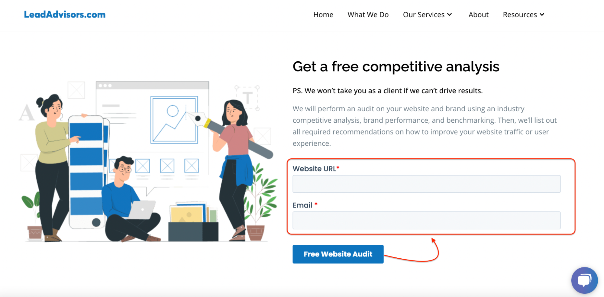
– Thinqi uses inline forms to promote gated downloads mid-article
– LeadAdvisors offers an inline free competitive analysis on its homepage
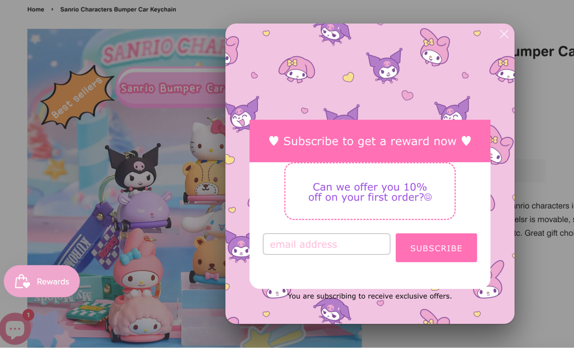
2. Pop-ups & Modal Forms
Pop-ups and modals grab attention fast. They appear based on scroll depth, exit intent, or time on page, and when paired with the correct value (like a discount, freebie, or gated guide), they can capture leads before a visitor bounces.
Best for: Lead magnets, newsletters, limited-time promos
Bonus tip: Keep it short—just a few fields to avoid form abandonment
Examples:
– Smart Insights uses exit-intent popups to boost ebook downloads
– Chamaileon.io prompts visitors with a clean modal for email sign-up
3. Floating Bar & Slide-in Forms
These remain on screen while a user scrolls and are not obstructive. Slide-ins commonly show up in the lower corner, while floating bars attach to the top or bottom of the screen.
- Best for: Newsletter opt-ins, promos, timed deals
Examples:
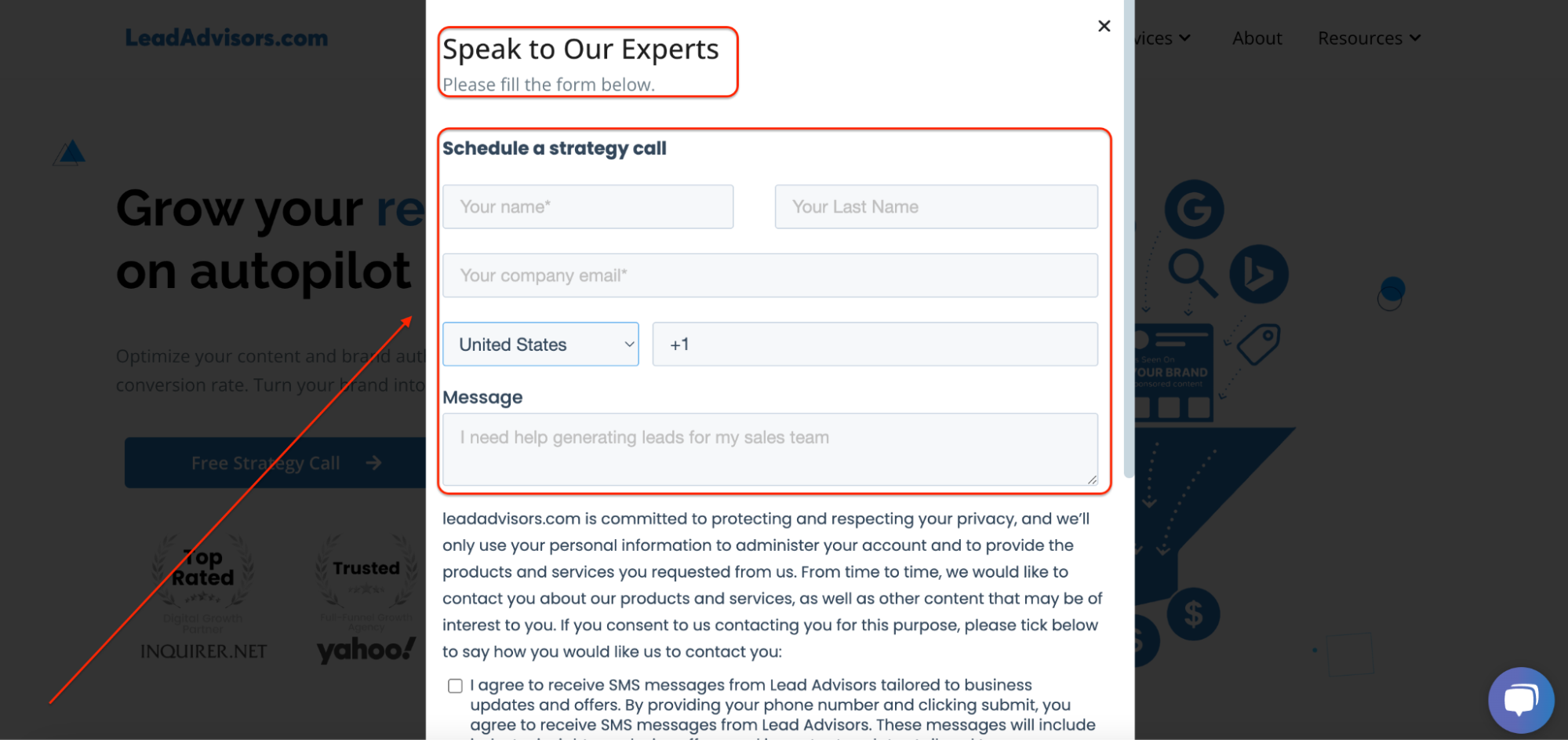
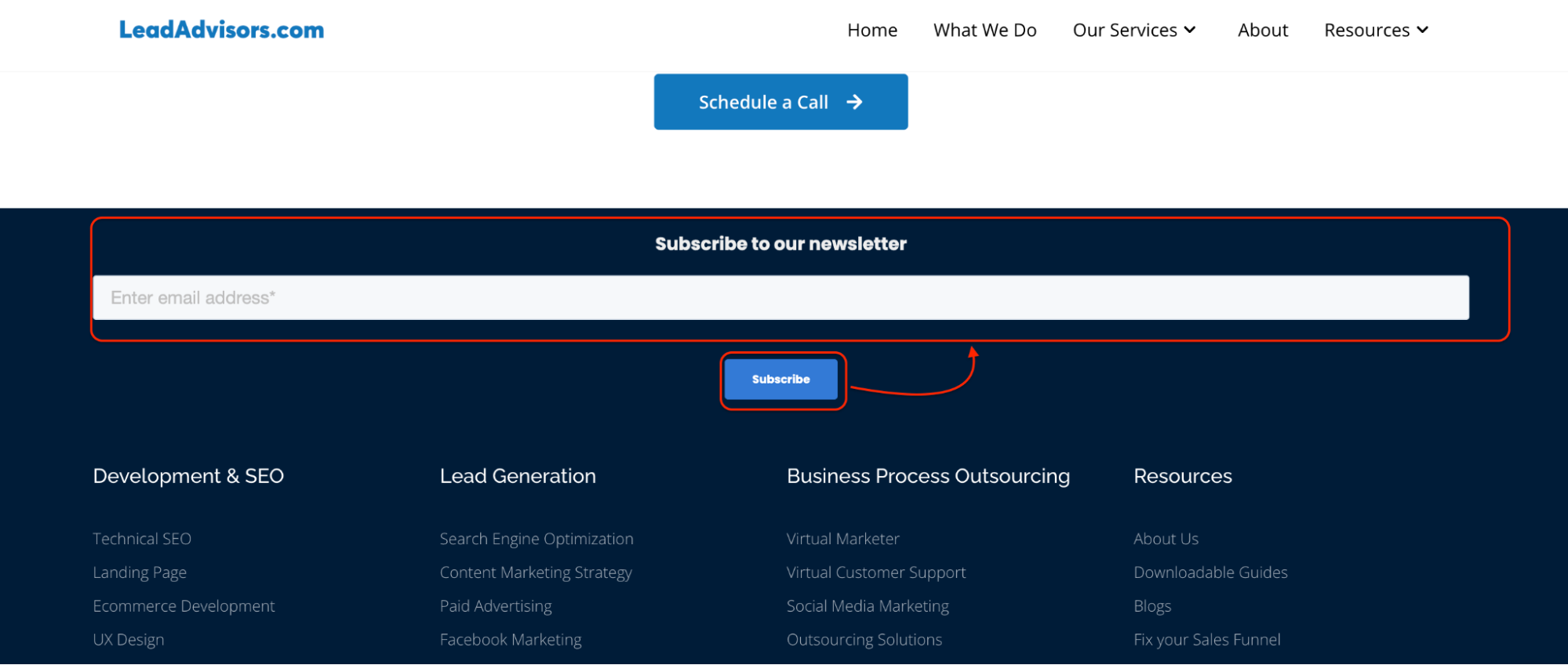
– LeadAdvisors has a floating bar for email collection
– ActiveCampaign uses sticky bars to create campaigns targeting user interest
4. Multi-Step Forms
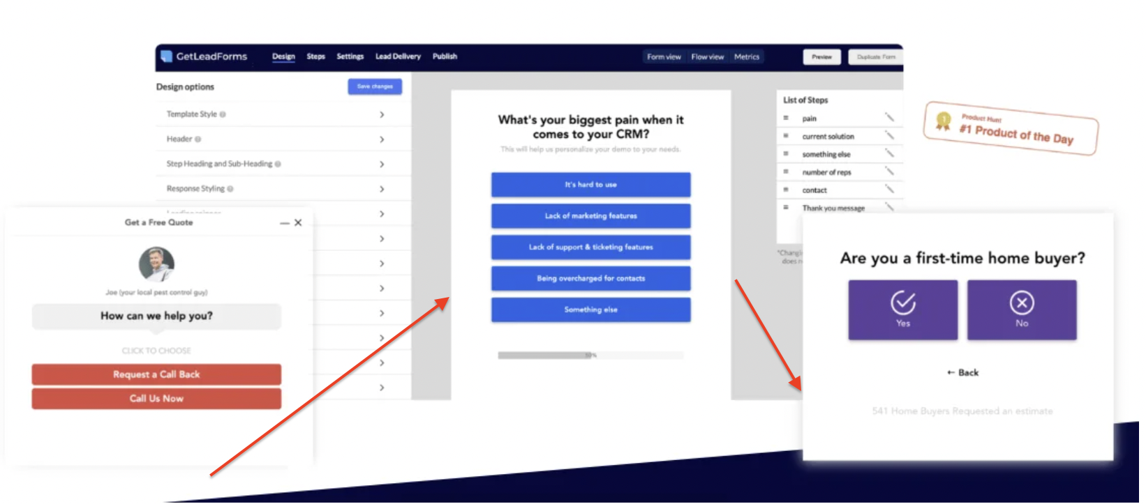
If asking for a lot—like company size, budget, or job title—breaking it down into steps can be a game changer. Multiple-step forms decrease friction and make the process feel more like a guided conversation than a data dump.
- Why it works: Less intimidating, better completion rate
- Best for: SaaS, B2B, agencies, high-value potential leads
Examples:
– ClickUp and Wealthfront use multi-step forms for onboarding
– Deel and ShotKit break long forms into digestible chunks
5. Gamified Forms (Spin-to-Win, Quizzes)
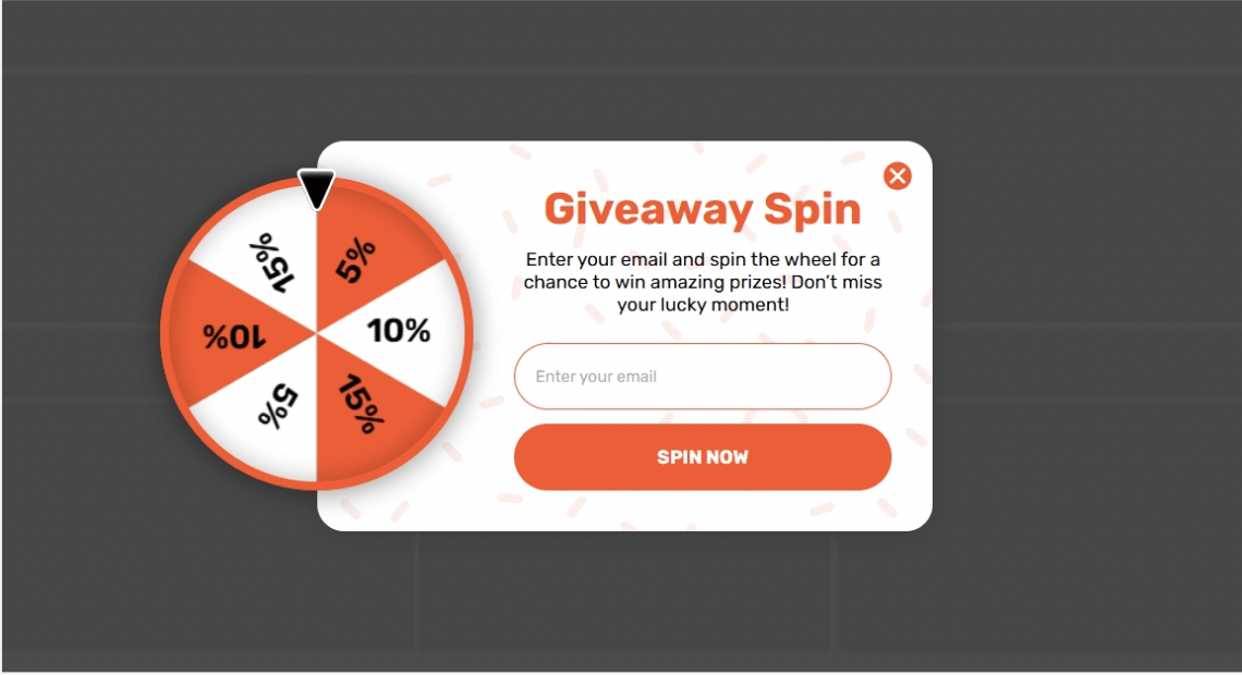
Want something fun and interactive? Gamified forms work well for ecommerce and DTC brands. They turn lead capture into a game, using wheels, scratch cards, or quizzes to boost engagement.
- Why it works: Encourages user responses, adds a dopamine hit.
- Best for: Promo codes, product discovery, segmentation
Examples:
– Pete & Pedro and PortraitFlip use Spin-to-Win wheels
– Purple uses product quiz forms with conditional logic to guide choices
6. Yes/No or Segmented Forms
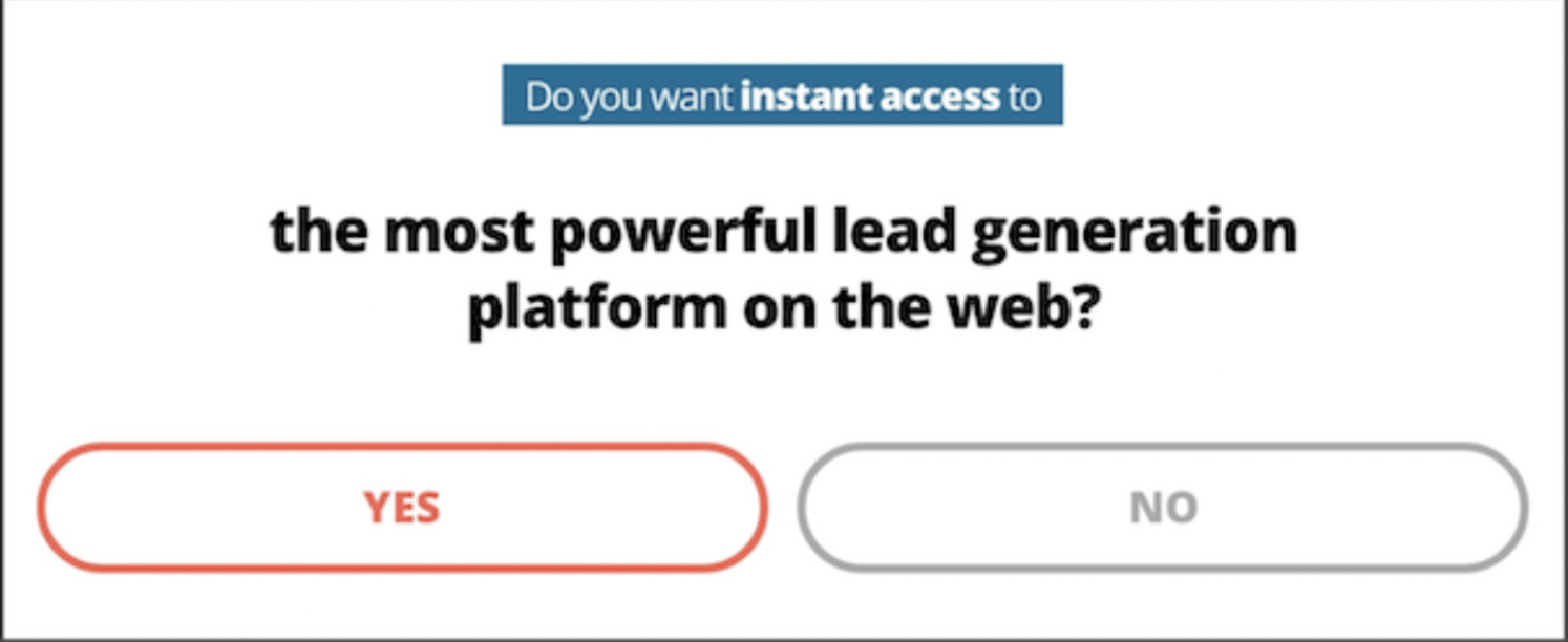
Sometimes all it takes is a single click to start. These forms ask a basic Yes/No or multiple-choice question, and then adapt based on the answer using conditional logic. This flow helps you qualify and route potential customers faster.
- Why it works: It feels personal and improves lead scoring.
Examples:
– SnackNation uses Yes/No questions to customize B2B outreach
– Bulkly segments based on business size and industry before asking for info
All these form types are helpful in your marketing campaigns. Whether you’re creating a pop-up for lead generation, a quiz for segmenting lead data, or an inline form for supporting evergreen content, a great form builder provides the flexibility to test, iterate, and enhance over time.
The trick is to closely align your form type with your goal and optimize based on how your audience is actually behaving.
Real-World Lead Generation Form Examples (Categorized by Industry)
Smart brands know that a well-placed form stops being a data grab and becomes an opportunity to drive intent, personalize experiences, and move prospects through the funnel.
We’ll examine how organizations and businesses in various industries use lead generation forms and present a shining example from each to spark ideas.
SaaS
In SaaD, it is all about simplicity and responsiveness. Start with a 1-3 field form, and request only the basic information: name, email, company size, etc. You will need to focus on the requisite fields – Slack, Unbounce, and Bulkly- and keep it to a minimum. Frequently, you see these on a landing page optimized for trials or demos.
Want a strong example? Check out Optimizely.
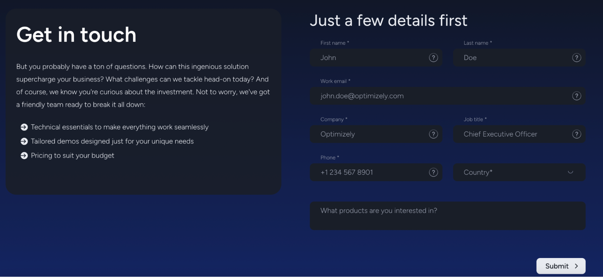
Their “Get in Touch” form showcases a clean, focused form submission experience. The layout is distraction-free, and the fields are minimal, just enough to qualify the lead without stalling progress. The mobile responsiveness and intuitive CTA placement help make this a model for efficient SaaS lead capture.
Other common SaaS tactics include:
- Progressive profiling (as used by Bulkly)
- Inline forms embedded into product or feature pages
- Crystal-clear CTAs paired with benefit-driven messaging
B2B & Professional Services
When it comes to B2B, forms need to work harder upfront. Brands like Microsoft Small Business Academy and Gembah use multi-step strategies that include lead qualification, calendar integrations, and even event registration prompts.
A great one to explore is ZenPilot.
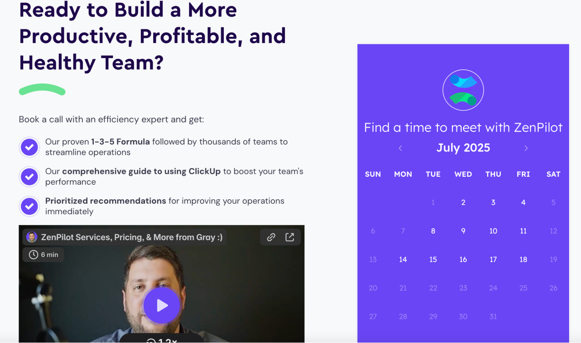
Their “Book a Clarity Call” form is straightforward yet insightful. Along with standard fields, it asks about business goals and challenges, helping their marketing teams segment leads early. The built-in scheduling tool adds extra convenience, allowing leads to book time without back-and-forth emails.
Other B2B strategies include:
- Downloadable gated assets like whitepapers
- Pre-qualification via technical expertise or project needs
- Embedded booking tools for faster conversion
Ecommerce & DTC
DTC and ecommerce brands move fast—and so do their visitors. Companies like Daily Harvest, Made With Local, and Athletic Greens keep their forms short, visual, and usually tied to discounts or first-purchase offers.
Here’s one worth modeling: Sperry.
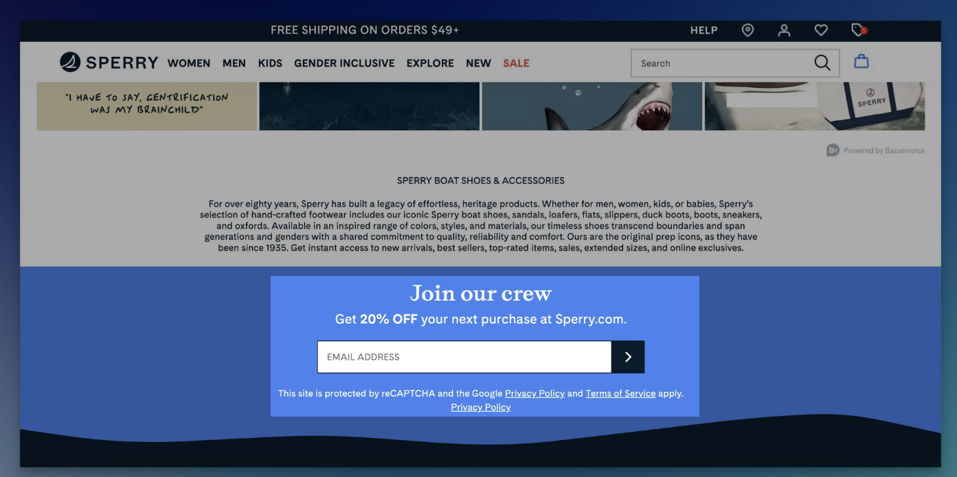 Instead of a disruptive pop-up, Sperry keeps it smooth and simple—a clean, on-brand email sign-up section offering 20% off your next purchase. It integrates perfectly with the site’s design, is super fast to load, and only requires one field.
The prompting is strong, the burden light and with its mobile-friendly design, it’s a smooth transition from a casual browsing customer to a return buyer. It’s intelligent, streamlined, and made to stay out of your way so you can stay scrolling.
Other ecommerce form wins:
- Exit-intent offers tied to contact info
- Promo-based forms that encourage impulse opt-ins
- Mobile-first layouts that reduce form abandonment
Mobile & App-Based Products
For mobile-based brands, the goal is immediate action. Apps like Marie Forleo’s B-School, OkCupid, and Simple Habit skip the fluff and ask only for what’s necessary—often just a phone number or email—before redirecting to the app store.
Take a minute to explore Marie Forleo’s B-School.
 The moment you touch down and you’re greeted with this: get on the VIP list and snatch up a free success guide. No distractions, no scroll traps — just one bold, high-converting CTA, one compelling headline, and immediate value.
Early access to their unlocked appetite, a downloadable freebie, or whatever irresistible offer. Combine that with the cheerful, assured imagery and the trust-building tone, and you’ve got a lead-gen machine that’s built for speed, especially on mobile.
Other mobile strategies include:
- “Send App Link” forms with instant redirects
- Optional fields based on platform preferences
- Micro-copy that addresses hesitation or builds urgency
Real Estate
In real estate, forms are built for deeper interaction. Brands like Woodside Communities and Engel & Völkers use detailed layouts that feel more like guided steps than forms. Visuals, agent bios, and booking features make them personal and persuasive.
You’ll definitely want to see how Engel & Völkers does it.
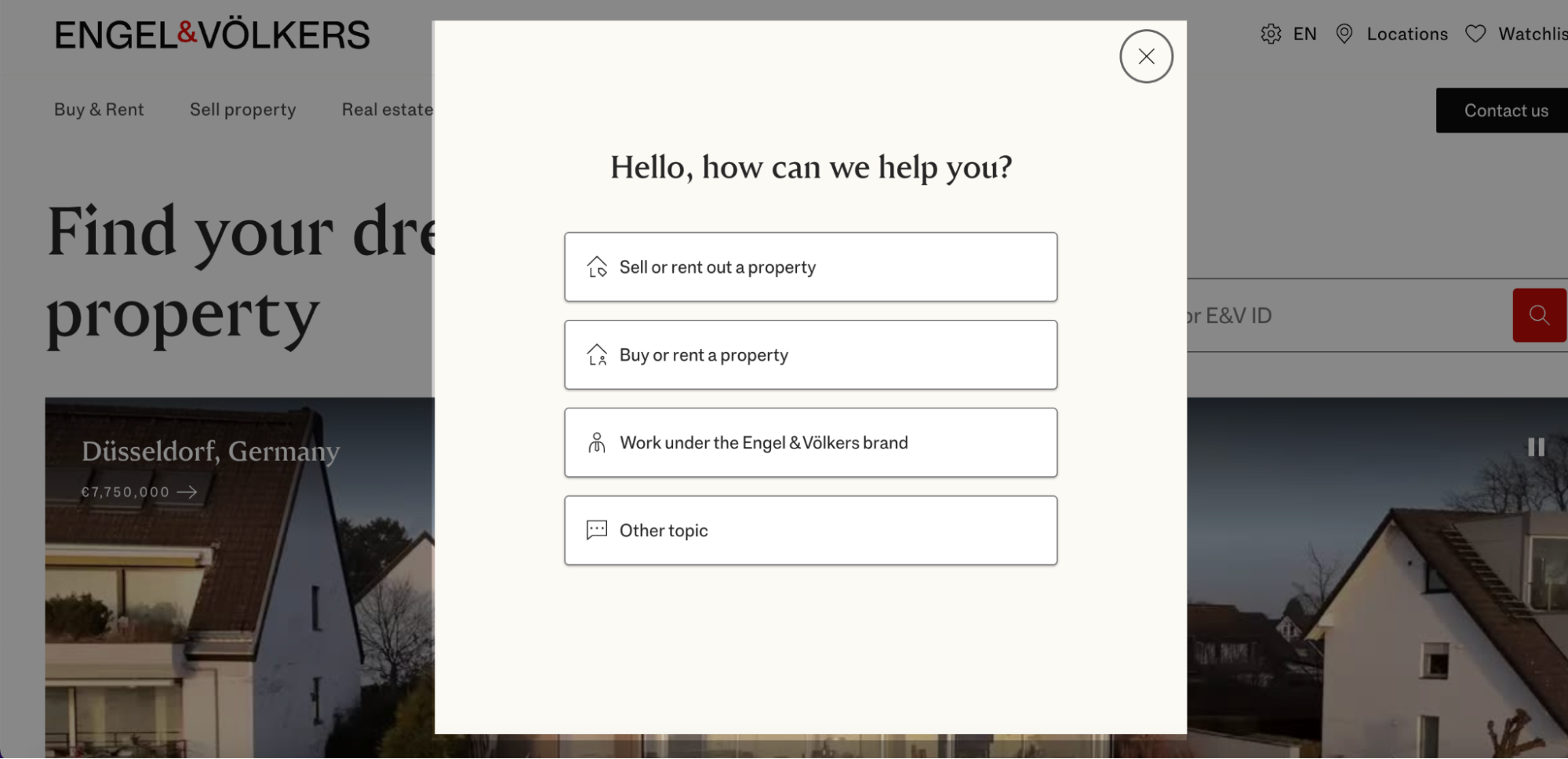 Their property inquiry forms ask for more—budget, location, contact preference—but use design to keep it light and approachable. Integrated calendar booking, paired with attractive property images, makes the form experience feel premium, not pushy. It’s a great example of blending information-gathering with emotional appeal.
Other successful real estate tactics:
- Map-based property selection
- CTAs like “Schedule a Tour” or “Request Info”
- Multi-field forms that balance detail with simplicity
Across every industry, the message is the same: good forms aren’t just functional—they’re strategic. From form builders that allow conditional logic, to simple designs that reduce form abandonment, these brands show that intentional choices can lead to better lead generation results and stronger relationships with potential leads.
Best Practices to Optimize Your Lead Forms
You’ve seen the form types. You’ve studied real-world examples. Now it’s time to put that knowledge to work. Whether you’re trying to collect better lead info, improve the experience across the customer journey, or simply get more form submissions, these best practices will help you increase conversions without sacrificing user trust.
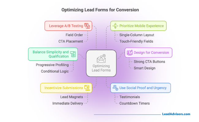
1. Balance Simplicity and Qualification
No one wants to fill out a 10-question form to get a simple download. But ask too little, and you’re left with vague leads your team can’t act on. The sweet spot? Ask just enough to qualify—like company size, job title, or use case—while keeping things light.
Pro tip: Use progressive profiling to collect more lead info over time. Or use conditional logic to show different fields based on user answers. This lets you tailor the form experience without overwhelming new leads.
2. Design for Conversion
Your form isn’t just about what’s inside—it’s how it feels. A strong CTA button with clear text like “Get My Free Guide” or “Book My Demo” beats a plain “Submit” every time. Surround that button with smart design: ample white space, clear contrast, and a layout that intuitively guides the user through.
Even a small change in button text or alignment can dramatically increase conversions, so make your visual design intentional.
3. Incentivize Submissions
No one gives up their email for fun. Show people exactly what they’ll get—and why it’s worth it.
Lead magnets work wonders here:
- A free eBook
- Exclusive webinar access
- Discounts or product checklists
Be direct and deliver fast. Your visitors should know instantly what they’ll walk away with, whether it’s an immediate download or additional resources via email.
4. Use Social Proof and Urgency
If your offer is great, prove it. Add testimonials, trust badges, or real user stats near the form to build credibility. A quote like “Over 10,000 users downloaded this guide last month” can give that final push.
Urgency also plays a role. Try countdown timers for webinars or “Only 12 spots left” prompts for events. These tactics nudge new leads to take action now, not later.
5. Leverage A/B Testing
Think your form’s working fine? Test it anyway. Something as small as switching button copy from “Submit” to “Get Started” could skyrocket your results.
Experiment with:
- Field order and number of inputs
- CTA placement and wording
- Color contrast and layout spacing
Use form analytics to track where people drop off. If they quit at the file upload step or stall on the company size question, that’s a signal it needs refinement.
6. Prioritize Mobile Experience
With most users browsing on phones, your form should feel like it was built for mobile, not just crammed into a smaller screen. Stick to a single-column layout, keep fields touch-friendly, and shorten your CTAs. No one wants to pinch and zoom just to tap “Next.”
Responsive design isn’t optional anymore—it’s the difference between gaining or losing a lead in the moment.
The takeaway? A well-optimized form is more than just a few fields and a button. It’s a strategic touchpoint in your customer journey, a reflection of your brand’s thoughtfulness, and often, the very first real interaction someone has with you.
Make it count.
Lead Form Placement & Timing Strategy
Even the most well-designed form won’t perform if it shows up at the wrong time—or in the wrong place. Strategic placement and timing are what turn a passive scroll into an active form submission. The key is to align your form’s appearance with the visitor’s behavior, page intent, and where they are in your marketing campaign funnel.
Above the Fold vs. Scroll-Triggered
Placing a lead generation form above the fold—right where users land—is a classic move. It works best when intent is high, like on a landing page offering a webinar or lead magnet. Visitors shouldn’t have to hunt for it.
But in blog content or educational pages, people often need time to warm up. That’s where scroll-triggered forms shine. They appear just as the reader becomes engaged, keeping the experience seamless while surfacing the CTA at the right moment.
Example: A SaaS company offering a free trial might place a short form above the fold on its pricing page, while using scroll-triggered forms in blog posts to capture interest as readers dive deeper.
Exit-Intent, Time-Delayed & Behavior-Based Targeting
Sometimes, you get one last chance—and that’s where exit-intent popups come in. When a user moves their cursor to close the tab, this form kicks in with a compelling offer: a discount, a free resource, or a reminder of what they’re missing. It’s subtle, but it often works.
Time-delayed forms serve a similar purpose. After a visitor spends 30–45 seconds on a page, the form appears, signaling that they’re engaged enough to care. For even more precision, behavior-based targeting triggers forms based on clicks, pageviews, or time spent across your site—ensuring the form aligns with real-time user intent.
These methods are perfect for nurturing lead information in mid- to bottom-funnel marketing campaigns.
Match Placement to Intent
The most overlooked aspect of form strategy? Contextual relevance. If your blog post is about “How to Build a Marketing Strategy,” the form shouldn’t push a product demo—it should offer a free planning template or access to a webinar.
When the offer matches what the reader came for, lead form performance improves dramatically.
Ask yourself:
- What’s the visitor doing right now?
- What would they actually want help with at this point?
- Is the form guiding them or distracting them?
Forms are not just for collecting lead information—they’re micro-moments that support your marketing campaigns and move the right people forward.
Common Mistakes to Avoid
| Mistake | Why It Hurts Your Form Performance |
| Asking for too much too soon | Overwhelms visitors and leads to form abandonment, especially if you’re collecting detailed lead information before building trust. |
| No value exchange or incentive | Visitors are unlikely to give up their contact info unless there’s a clear benefit, like a discount or valuable resource. |
| Poor mobile layout | Clunky designs, small buttons, or multi-column fields hurt conversions on mobile, where many new leads come from. |
| Generic CTA copy (e.g., “Submit”) | Vague CTAs fail to motivate. Action-oriented text like “Get My Free Guide” or “Start My Trial” performs much better. |
| Not following up on submissions quickly | If follow-up is delayed, leads go cold. Immediate response supports a smoother customer journey and boosts engagement. |
Final Thoughts + LeadAdvisors’ POV
A well-crafted lead generation form does more than gather data—it kicks off a meaningful connection. When designed with user intent and clarity in mind, forms help guide visitors through the customer journey and turn interest into action.
The best-performing forms are simple, intentional, and built to convert. They’re tested, refined, and backed by a real value exchange.
At LeadAdvisors, we help brands build smarter forms that seamlessly integrate into their marketing campaigns. From layout to timing to targeting, we create form strategies that don’t just capture lead information—they spark real growth.
Want forms that do more than collect clicks? Let’s make every submission count.