A logo is not just a piece of design – it’s the building block of your brand and one of the first things people recall about your company. From the neutrality of wordmarks to the imagination of mascots and the flexibility of contemporary animated logos, all types convey a distinctive message and define how your audience sees you.
That’s exactly why I’ll introduce you to all the types of logos, what they mean, and some real-life examples (from famous brands such as Apple or Nike so you can get an idea.) I’ll also include a business logo example, university logos, and simple illustrative logos that show us that less is often indeed more.
When you’re done here, you’ll be able to determine what type of logo is best for your brand and how to design a logo that’s timeless, memorable, and speaks exactly to what you want.

What Is a Logo?
A logo represents a business, company, or personal profile. At its most fundamental, a logo serves as an identity marker – it distills the personality, character, and values of a business into one easily identifiable graphic that every customer can nearly instantly associate with your brand. When people search “logo meaning” or wonder “what are logos?” they really want to know how a simple picture could represent the shared soul of something more.
It is important to differentiate between brand, a logo, and branding. A logo is the mark itself. A brand is what comes to mind when your name is mentioned. Branding is the ongoing work on what makes your organization what it is through design, messaging, and experience.
Globally, in different languages, the contribution is referred to using other words: logotipo (logotype) in Spanish and brand mark or logo mark. If you’ve ever asked yourself, “What logo is this? ” Tools like Google Lens or reverse image search can help identify unfamiliar marks.
The 12 Main Types of Logos
Logos come in different shapes, sizes, and uses. Understanding the different types of logos will help you choose the best design for your business. Here are 12 of the most common types of logos and leading examples to show how brands have successfully used them.
1. Wordmark Logos (Logotypes)
![]()
The brand’s name is a wordmark in the logo itself. Plain typography transforms the name into the logo. Wordmarks are fine if the brand name is brief, memorable, and essential to identity.
Best for: New businesses seeking to establish name awareness.
Famous examples: Google, Coca-Cola, Visa.
2. Lettermark Logos (Monogram Logos)
![]()
Commonly mistaken for wordmarks, lettermarks consist of abbreviations or initials rendered as a logo. This method condenses long names into condensed yet recognizable marks.
Best for: Companies with long names requiring a neater visual identity.
Famous examples: NASA, IBM, HBO.
3. Letterform Logos
![]()
A letterform logo minimizes the design to one letter, which is thus made bold and easily recognizable. Its simplicity guarantees good visibility at small sizes, such as app icons.
Best for: Brands that have high early recognition.
Famous examples: McDonald’s “M,” Netflix “N.”
4. Pictorial Logos (Brand Marks)
![]()
Pictorial logos (also known as brand marks or logo marks) depend upon a graphic icon or symbol. These logos can be literal or symbolic, yet they always convey brand identity through images.
Best for: Those businesses with a compelling visual identity or international presence.
Famous examples: Apple, Twitter, Target.
5. Abstract Logos
![]()
Rather than literal icons, abstract logos employ shapes, color, and form to communicate meaning. As such, they are suited for brands in need of uniqueness.
Best for: Companies seeking variety and distinction.
Famous examples: Nike swoosh, Pepsi globe, Adidas stripes.
6. Mascot Logos
![]()
Mascot logos are designed with illustrated figures that embody a brand’s personality. They tend to be friendly and fun, and companies with a family-friendly image tend to favor them.
Best for: Companies that appeal to youthful markets or desire a lighthearted reputation.
Famous examples: KFC’s Colonel Sanders, Michelin Man, and Planters’ Mr. Peanut.
7. Emblem Logos
![]()
Emblem logos combine text within a symbol or badge and usually symbolize tradition and authority. They are typical in education, government, and automotive sectors.
Best for: Institutions or brands emphasizing heritage.
Famous examples: Harley-Davidson crest, Harvard University, and Starbucks.
8. Combination Mark Logos
![]()
A combination mark logo combines text with a pictorial, abstract, or mascot component. The two-pronged approach provides flexibility: brands may deploy text and icon together or apart.
Best for: Companies that desire both name and symbolic recognition.
Famous examples: Adidas, Lacoste, Burger King.
9. Dynamic Logos
![]()
Dynamic logos change their shape based on context while maintaining a central identity. They embody flexibility and creativity, frequently altering colors, forms, or details.
Best for: Digital-first companies looking for versatility.
Famous examples: Google Doodles, MTV.
10. Animated Logos
![]()
Animated logos bring them to life, making them memorable and interactive. With the development of digital media, they’ve become a go-to for online channels.
Best for: Tech companies, media brands, and content creators.
Famous examples: YouTube animation, Warner Bros. intro.
11. Line Drawing Logos
![]()
Contemporary and straightforward, line-drawing logos employ clean strokes and minimalism to convey elegance. They’re a hit in the fashion, wellness, and lifestyle industries.
Best for: Brands looking for a contemporary, minimalist appeal.
Famous examples: High-end fashion and boutique wellness brands.
12. 3D Logos
![]()
3D logos employ depth, gradients, and shadowing to give an impression of realism and innovation. They are ideal for industries where visual impact is essential.
Best for: Gaming, entertainment, and tech companies.
Famous examples: Xbox, Pixar lamp logo.
Combined, these 12 logo types span from tradition to contemporary innovation, offering brands tens of thousands of ways to represent themselves.
Logo Variations and Styles
Sure, having a logo type to chase is of the utmost importance, but understanding alternate versions and styles ensures your design never lets you down. One logo will never fit all, so companies create multiple similar logos that can be adapted to work across different platforms. The variation recognition is good depending on its use, be it a website header, mobile app icon, or goods print. If you’re exploring how to create these variations professionally, working with experts in logo design Dubai can help you craft flexible designs that look great anywhere.
- Horizontal vs. stacked versions – Horizontal logos are great for websites, banners, and packaging, but a stacked version will work better on mobile apps or any square layout.
- Black-and-white vs. color – Logos need to be readable in black and white when photocopied or faxed or used on a product in grayscale scale (such as newspapers) and also be distinguishable when printed in a single color.
- Responsive/adaptive logos – Logos that scale up or down, depending on the device. A complete logo on a desktop, but a reduced visual cue as an icon on a mobile device, for example.
- Seasonal and campaign-based variations – Brands establish temporary or alternate logos for celebrations (Google Doodles are a classic example).
Upon having these logo types in place, you maintain a consistent brand, allowing flexibility in both format and circumstance.
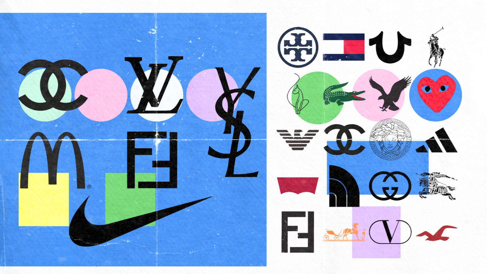
Famous Logo Examples Across Industries
Learning about renowned logos is one of the most effective ways of understanding how design affects recognition and trust. From global companies and universities to cultural icons, such brand logos demonstrate how varied methods can leave a lasting impression. The following are some well-known examples of logos across industries.
Business Logos
![]()
From retail to start-ups, business logos are created with memorability and scale in mind. Retailing behemoths Amazon employ combination marks (icon + word) to convey both name recognition and scope of service.
Meanwhile, start-ups like Slack count on adaptive logos that evolve in digital spaces. Corporations like IBM or Samsung prefer wordmarks for international clarity. These logos demonstrate that the optimal selection is subject to audience and reach.
University Logos
![]()
University logos tend to rely on emblem-designed logos to represent tradition and authority. Oxford University employs a shield-style logo with Latin text, while Harvard’s crest has its famous “Veritas” motto written in it. Such emblem-dominant styles echo prestige and tradition, hence being ageless definitions of academic logos.
Indian Logos
![]()
Cultural heritage dominates Indian logos, where symbols tend to be meaningful. SBI is symbolized by security and trust through a blue circle and a small cutout. Doordarshan, India’s state broadcaster, also uses a swirling eye design, meaning vision and reach. These sample logos show how regional identity can inspire brand recognition.
Simple and Easy Logos
The most powerful design is a simplistic logo. The Nike swoosh and Apple’s bitten apple prove that less is more when it comes to universal acknowledgement. Simple logos like this are powerful because they work at any size, anywhere, and are immediately recognizable for what the brand is about.
Art-Inspired Logos
![]()
Creative sectors such as fashion, design, and innovative brands often use fancy logos with bespoke type or illustrations/hand drawings. Salvador Dalí made the logo for Chupa Chups, an intersection of art and brand. Abstract linework is also frequently utilised across most graphic design logos alongside custom typography, which goes beyond just being an identity.
How to Choose the Right Logo for Your Brand
![]()
Choosing the right logo for your company is not just about creating something that looks good – it’s about building a visual identity to connect with your audience and help grow your brand over time. Whether you’re brainstorming business logos, designing a startup logo, or need company logo inspiration for your established business’s 2020 rebrand, the design process is more than just what you see on paper. Here’s a step-by-step guide.
Step 1: Define Your Brand Identity and Values
Before you begin doodling ideas, define what your brand represents. Is it innovative and daring, or classic and reliable? Your logo should embody these core values so customers immediately recognize what you’re about.
Step 2: Consider Your Industry and Target Audience
Different industries favor certain logo styles. Tech brands often prefer abstract or dynamic marks, while universities favor emblems. Consider who you’re targeting – professional audiences may respond to clean wordmarks, while family-focused businesses may benefit from mascots.
Step 3: Choose the Right Logo Style (With Pros and Cons)
Every logo type has strengths and limitations. Here’s a quick comparison:
| Logo Type | Advantages | Disadvantages |
| Wordmark | Clear name recognition, professional look | Less versatile if the name is long |
| Lettermark | Compact, modern | May confuse new audiences unfamiliar with initials |
| Letterform | Simple, memorable at a small scale | Lacks context if the brand isn’t well-known |
| Pictorial/Brand Mark | Universal appeal, strong symbolism | Requires brand recognition to be effective |
| Abstract | Unique, versatile | Harder to interpret without context |
| Mascot | Friendly, approachable | May not suit formal or luxury industries |
| Emblem | Traditional, authoritative | Can be complex and less scalable |
| Combination Mark | Flexible (text + symbol) | It may look cluttered if poorly executed |
| Dynamic/Animated | Engaging, modern | Can lose consistency if overused |
| Line Drawing | Minimalist, elegant | It may appear too simple in some industries |
| 3D Logos | Bold, high-impact | Risk of becoming outdated quickly |
Step 4: Test for Scalability and Memorability
A good logo performs equally well on every size, from billboards to business cards. Try it out in black and white, with small text and computer icons, to ensure it’s still readable and identifiable. Ask yourself: Can someone draw it from memory after being shown once?
Step 5: Explore Logo Tools (Adobe, Figma, Canva)
Design software and web platforms make creating logos easier than ever. Adobe logos (created using Illustrator or Photoshop) provide professional versatility, and Figma is great for group design. Canva has templates for instant, tweakable fixes that are useful for small companies or startups testing out various graphic design logos.
2025 Logo Design Trends
![]()
Logo design keeps developing, pairing ageless principles with contemporary innovation. Brands embracing fresh logo concepts and innovative strategies remain relevant in rapidly changing markets. In 2025, look for a combination of traditional influences and creative logo designs that reflect cultural changes, technology, and consumer behavior. The following are the largest trends defining the future of graphic design logos.
AI-Influenced Logos
AI is also changing the way logos are conceived and crafted. AI-enabled tools can generate scores of design ideas at a time, scan consumer sentiment, and optimize visual styles to match brand identity. Those logos are likely to be generative patterns, futuristic fonts, and responsive designs.
Eco-Conscious and Minimalist Styles
The design process in every sector is being influenced by sustainability. They’re taking on stripped-down logos with straight lines, earthy tones, and environmentally conscious symbols like leaves, circles, or the colors of Earth. These logos convey responsibility, and at the same time hold a timeless and simple design.
3D and Depth Effects
Flat design was the watchword of the last decade, but 3D logos are back. These logos jump out in digital spaces, which feature realistic shading, shadows, and depth effects. 3D: Technology brands & entertainment companies especially covet 3D as a stunning visual statement.
Dynamic and Animated Logos
As more people interact online, animated and dynamic logos are no longer optional. With motion-led design, storytelling becomes a literal power to bear on brands in the way they engage with viewers of a website or users of an app or social media. Think of Google Doodles, or animations on a streaming platform that bring brand marks to life.
Heritage Meets Modern (Reviving Classics)
Some brands are pulling out their classic logos and sprucing them up for a new generation of consumers. This appetite mixes past and present, as typefaces are energized, details refined, and “the old mark” put into a scalable digital form. It’s a nod to honoring heritage while still being modern.