Websites have become essential to daily life as we spend more time online. You’re probably using one for various purposes, such as marketing or blogging. If that’s the case, you must know how important web design is.
If nobody wants to look at your website, no one will read your content or check your products. That’s why you must make it a point to provide an intuitive user experience for your online visitors. Fortunately, this article will break down all the best tips and tricks!
Top Web Design Tips
We will kick things off with the most important rules of thumb for designing your website. You can still follow these steps if you don’t have any coding experience. Later, we will even discuss how you can build a website without such skills!
#1. Start with your sales funnel.
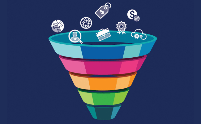
What if you’re not using your website to promote products and services? You will still need to design your website as if creating a sales funnel.
That is a company’s plan to guide potential customers into buying its offerings. This planning should also guide you if you have other non-marketing objectives for web design.
That’s because the general goal of a sales funnel is to persuade people to reach you and use your products and services. You can replace the latter with getting people to read your blog or for other purposes.
Why build your goal around a sales funnel? It’s a method that allows businesses to meet their short-term and long-term objectives. The funnel lets you gather real-time data and adapt so that you can stay on your goals.
A sales funnel can also help you figure out how your customers will go through your site, a valuable skill for web designers. Use it to guide your user experience according to your objectives.
If you’re already a business owner, you probably know the ins and outs of a sales funnel already. Otherwise, click here to learn the basics of building a sales funnel.
#2. Keep your buyer’s persona in mind.

You will have to know how your website visitors behave and think so that you can build its visual elements accordingly. Businesses can learn about their customers through various methods, such as surveys.
They could also deduce certain traits based on the general description of their target market. Let’s say you have a business that sells sweets such as candies and chocolates.
You can say that most of your customers would be children. This likely means they prefer bright and cheery colors on your products and website.
Still, you will have to create your web design by making sure yours stands out from competitors. You might also need to make your website mobile-friendly since most kids use smartphones and tablets nowadays.
This quick exploration of a buyer’s persona lets you derive this many web design strategies. Imagine how much more you can do if you spend more time on this!
#3. Apply visual hierarchy to your homepage.
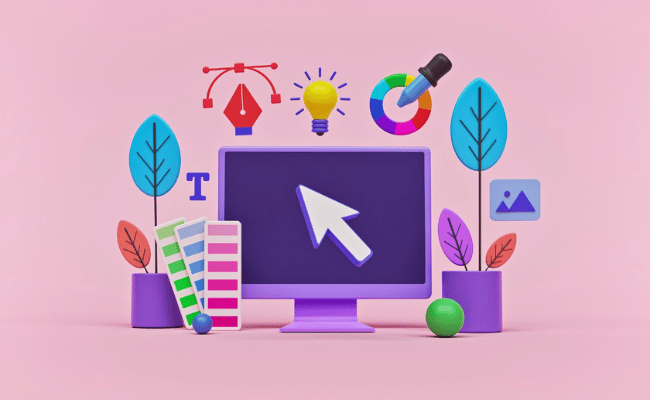
Web design is where form and function merge into one. The appearance of your professional website should make it useful for you and your online visitors.
That means building that website while keeping in mind how people read. Our eyes browse through web pages in a certain way. That’s why your site must follow a visual hierarchy.
Here is how you can arrange your page elements using this principle:
1. Arrange text on your website.
Most people read by following the F-Pattern. They start from the left and look for important keywords at the top.
It would be best to place links to your most important web pages on top so people can snap at them immediately. Below that array of options, add your company name and a few details in large font.
2. Use the right font size and style.
You could uniquely write your words, but make sure people can quickly understand what the body text says.
The safe option is to stay with block (non-cursive) fonts and try to make the other page elements unique. Also, it is a good idea to use three levels of font style (e.g., 36, 24, 12).
Assign the largest font to the most important topics, the second-largest font for their parts, and the smallest one for the body text.
That will help you and your readers make sense of the visual hierarchy of your web design.
3. Enhance the visual elements.
Go through the visual elements after planning the text. Select three colors that you want to be prominent throughout your website.
It would be best if you chose your brand’s colors, but you have to be careful if you have bright colors. Your brand might be orange, but having that tint on all your web pages would hurt peoples’ eyes.
You might want to use color theory to help you. It’s usually represented by the color wheel that quickly shows you complementary and supplementary colors.
#4. Get rid of stock visual elements.
A web designer’s job can be complicated, so their fees might be too high for startups or small businesses. That’s why online website builders are becoming more prominent nowadays.
Most promise to help beginners create professional websites like they’re skilled designers. Still, users are in charge of how to use the tool.
One of their worst mistakes is filling their website with stock photos. We see the “fakeness” of these photos without even realizing it, so we tend to avoid them.
Meanwhile, using photos from your brand adds authenticity to your website. You may hire someone else to do that part or do it yourself.
Also, it’s best to use it as a background for your text so more users interact with it. Overlay a transparent color over the image. That way, the picture can draw attention to the text while making it easy to read.
You may want to edit it so the image fades softly from left to right. This method allows the image to follow the F-pattern we discussed.
#5. Provide convenient user experience.

So far, we’ve just covered the visual aspects of web design. After discussing the form, we must now elaborate on the function.
Most websites are made up of different pages, so you must implement a web design throughout all of them. What’s more, it should connect them all into a cohesive website.
They should see the part they’re looking for and snap to it with just a click. Back then, websites had their options listed on drop-down menus.
Unfortunately, this became too fiddly for users as time passed. They just don’t have the time to sift through the slide-downs.
That’s why it would be best to condense your content’s basics into a single page. The introduction must provide an options menu that lets you snap to each one with a click.
If people want to read more about a section, they should be able to click on a link within a certain section of the homepage. That is especially necessary if you’re offering an online service.
The homepage can provide basic information. Then, people can snap to specific web pages for each subscription plan. Make sure you’re not just focused on the desktop version, though.
#6. Make sure the website is mobile-friendly.

People often use smartphones and tablets to browse the internet. These portable devices can pretty much cover everything a person needs when online.
That’s why more people are mobile users of the internet. In response, businesses must ensure their website doesn’t just work for its desktop version.
That means going through the core of your web design: the website configuration. Here are the types you can find on the internet:
Separate Site
People in the past used to have a desktop site and a mobile site for the same URL, so people opened the ones that fit their devices.
That took a lot of effort and time since you will need at least two different styles of web design instead of one.
Dynamic Serving
Eventually, more smartphone models entered the market, so people needed to have more web design formats for each one.
Imagine just how long the design process would take!! That is an impractical method nowadays because we get new models every month.
Responsive Design
Nowadays, people just make a website adapt to whatever device that mobile users are using.
Google also prefers websites with responsive design, so they’re more likely to rank high on its search results. They also load faster, so they can further enhance the user experience.
Google and the entire internet improve rapidly, so it’s easy to get left out. That is why you have to check your website from time to time.
Make sure that it still appears normally on desktops and mobile devices. Fix any errors or bugs as soon as possible.
#7. Adjust for search engine optimization.

How do Google and similar websites recommend content to their users? The answer will help you understand one of the most fundamental web design tips.
Some people refer to the internet as the World Wide Web. Its “spiders” come from search engines. These web crawlers analyze websites to collect data about them.
They use that information to match user queries with the most relevant search results. Specifically, they look for certain keywords that match someone’s search questions.
Search “best electric vehicles,” and the search engines will look for websites that contain relevant keywords such as “Tesla” or “EV.” Then, it will list the most relevant sites on the first page results.
You can increase the chances of earning the top search rankings with search engine optimization. That mostly involves including the right keywords on your website.
Aside from placing them on the body text, they must also appear on the other website elements. These include the meta description and meta title.
Web design can help you gain a creative edge over your competitor’s site, but you still need Google to find you. Otherwise, people will have a hard time finding your site.
#8. Highlight unique offers.

Featuring a promo at the start of your website serves two purposes. First, it gives visitors a reason to keep reading. They will have to spend more time on your website if they want your discounted prices.
Second, it helps you draw in more visitors. That special offer may convince more people to buy your products and services. What if you just have a blog or other non-marketing goal?
Then, you may place your best and latest work there instead. Content writers could feature their latest blog posts on the homepage. No matter the purpose, you will need an effective call to action.
Your content should tell people to do something, or they’re likely to ignore it. Also, a call-to-action or CTA helps in accomplishing your web design goals.
If you have blogs, tell people to read them right away. For marketing, you may place a deadline for your promos, so people would feel compelled to try them.
#9. Keep on trying new things.

That is the most important out of all the web design tips on this list. This article provides very good points, but they may soon become outdated.
Technology moves so fast now that you will have to always be on the lookout for new trends. That means checking how Google changed yet again.
Also, you will have to keep up with the new software and gadgets. That way, you can adapt your website to them as they appear. If you see most people doing something, it’s probably outdated by then.
That’s why it’s best to try methods other companies aren’t using yet. It’s risky, and can feel uncomfortable knowing you’re the only one trying such methods.
Yet, it’s necessary if you want to keep having the edge over competitors. Change has always been part of daily life, but it’s much faster in our current times.
Can you create a professional website without a web designer?
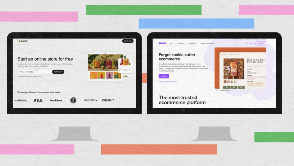
Hiring someone to build your website can be expensive. As mentioned earlier, various websites can help you build one yourself without paying so much.
Square Space and Wix are some of the most popular ones. They let you drag and drop certain elements so you can build a website within minutes.
Moreover, they can provide you with a domain for your website. Otherwise, you could use your existing web domain or another website like Hostinger.
Final thoughts
You can skip all this hassle by outsourcing to a digital marketing agency. At LeadAdvisors, you can rest assured that it has the experts you need for excellent web design.
They will take care of placing the text, images, and other elements. That way, you can keep focusing on the other important aspects of your business.
If you don’t have a company, LeadAdvisors can leave your time open for other stuff you love. Click here to learn more about how LeadAdvisors can help you.
Published on October 31, 2022; Updated on January 20, 2024.

