
Most people don’t obsess over their website footer. It’s the quiet underdog of web design – tucked way below the fold, often treated as an afterthought.
But here’s the twist: your footer might be the most powerful part of your entire web page.
A surprising stat? Studies show that visitors spend a huge chunk of time scrolling all the way down. Whether they’re looking for contact details, trying to get a sense of your brand’s credibility, or just deciding if they trust you, it all happens in the footer.
So no, it’s not just a dumping ground for legal disclaimers and copyright info. A smart footer design can:
- Supercharge SEO
- Help users navigate your site more smoothly.
- Build trust and domain authority.
- Even boost lead generation (yep, conversions happen down there too)
In this step-by-step guide, we’re breaking down everything—from choosing the right footer links to integrating social media links, showcasing killer website footer ideas, and showing you real-life footer examples that actually drive traffic.
P.S. Feeling a little overwhelmed? No pressure – we can totally help you craft the perfect website footer design that’s clean, clickable, and conversion-friendly.

What is a Website Footer? (And Why It Matters)
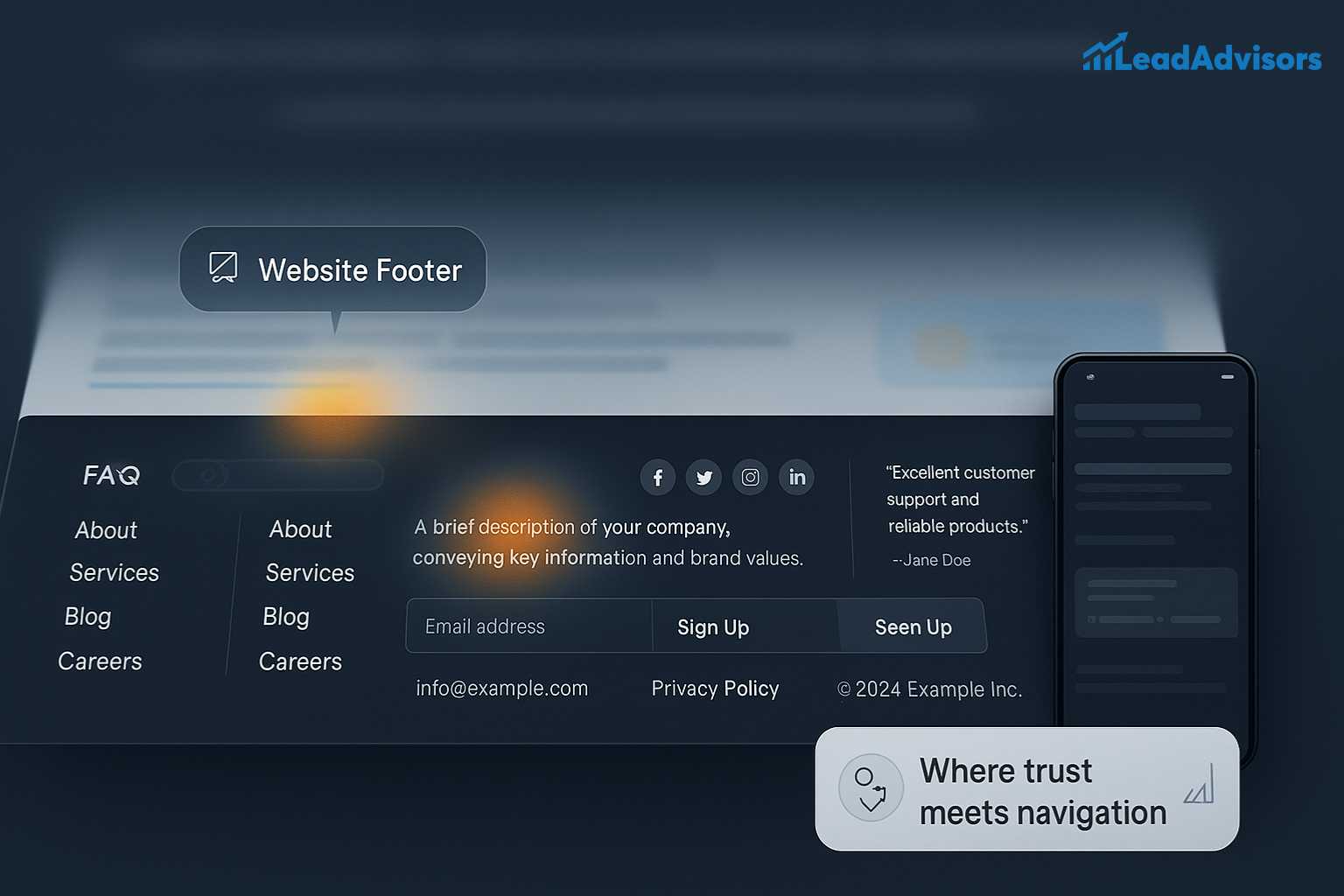
Let’s break it down: a website footer is the bottom section of your web page – the space where visitors expect to find essential info, footer links, and often a final impression of your brand identity. It might not seem flashy, but this humble space does a lot of heavy lifting.
Consider it your site’s “last chance” to engage a visitor. Whether they’re hunting for contact details, curious about your privacy policy, or ready to follow your social media links, your footer is the trusted go-to area.
Now, there’s a common myth floating around: “Nobody scrolls that far down.”
According to the Nielsen Norman Group, users do scroll, and more importantly, they linger. Eye-tracking studies show people spend more time below the fold than we think. That means your footer’s layout matters more than ever.
A Well-Designed Footer Can Do More Than You Think:
- Boost Navigation – Help visitors quickly find important pages like FAQs, About, or Services.
- Build Trust – Featuring company bios, contact details, or testimonials reinforces credibility.
- Improve SEO – Internal footer links help search engines understand your site’s structure.
- Enhance UX—By including smart graphic elements or a clean layout, your footer content becomes a valuable part of your website’s content, not just filler.
Want some inspiration? Check out these footer examples and swipe ideas from some of the best website footer designs on the web. Whether you’re minimalist or bold, there are endless footer ideas to explore and customize.
And hey – if you’re tracking how people use your site, tools like Google Analytics can show how often folks interact with the footer. (Spoiler: it’s more than you think.)
Types of Website Footers: Choosing the Right Layout
1. Fat Footer
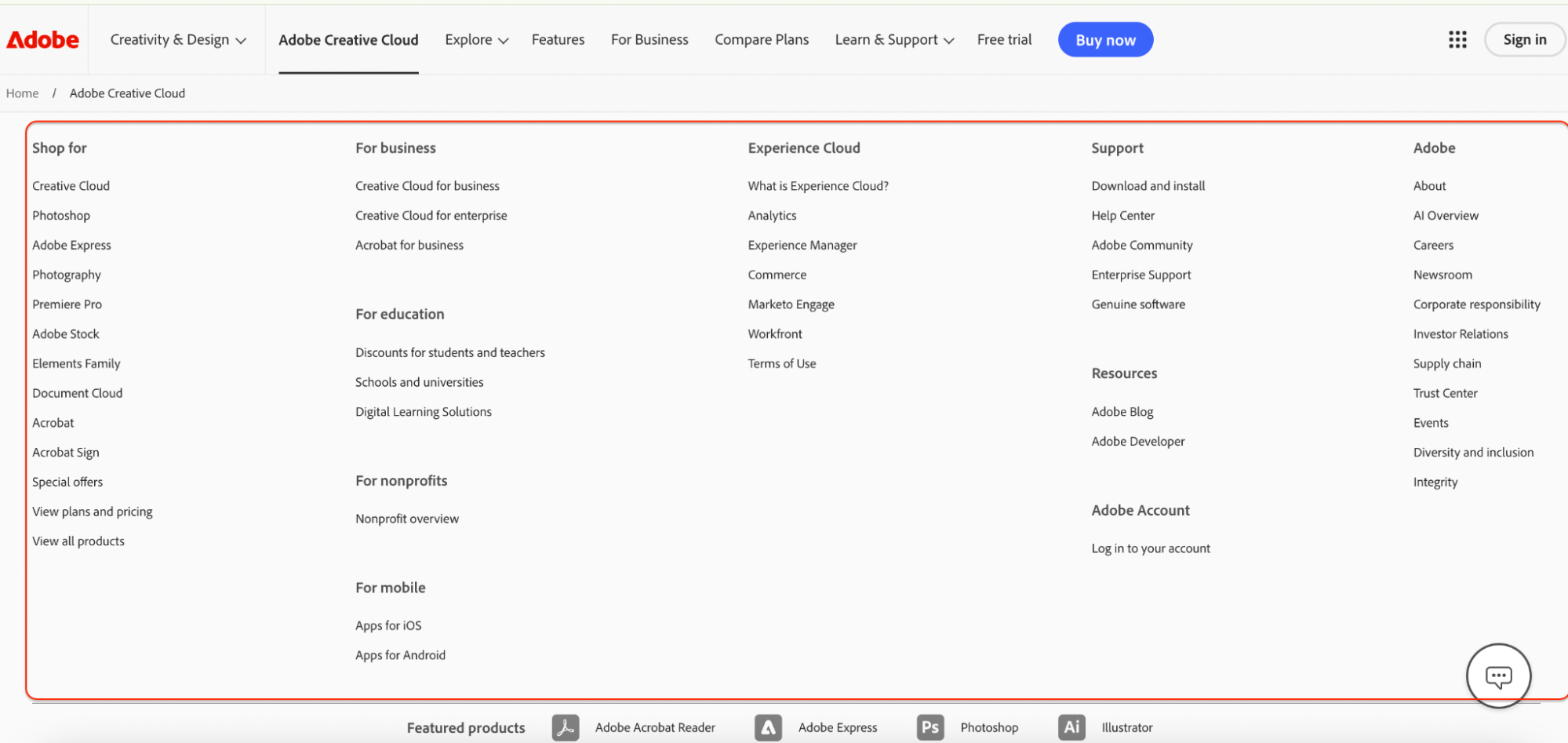
Think of the fat footer as the “superstore” of footer designs – it’s big, bold, and stacked with links. You’ll often see it broken into columns like Services, Support, Resources, and more. It’s perfect for websites with tons of pages that need to keep things organized, as shown below.
Visitors appreciate this setup because it helps them find what they need without scrolling back up. Want a great example? Check out The Guardian or Adobe.
2. Narrow Footer
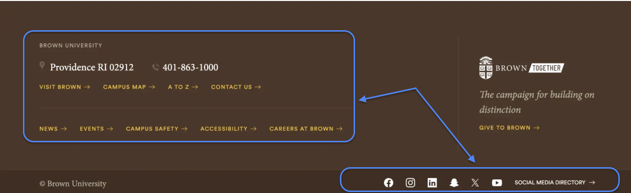
This one’s a minimalist’s dream. A narrow footer is clean and to the point – just the essentials like a logo, a couple of footer links, and maybe some social media icons. It’s low-key but still gets the job done for smaller sites that don’t need a deep nav menu.
Great for portfolios or landing pages where you want to keep things light and modern. For inspo, take a peek at Airbnb or Brown University.
3. CTA Footer
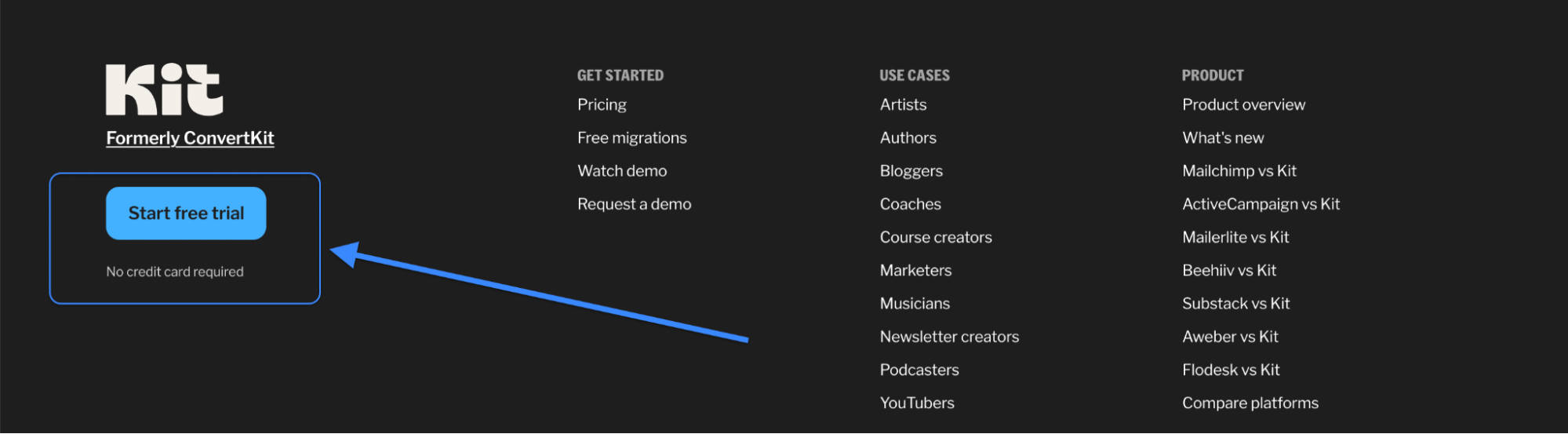
Ready to turn casual visitors into loyal fans? A CTA footer is built to drive action – it might invite people to sign up for your newsletter, book a demo, or download a freebie. You’ll usually see bold buttons, friendly copy, and maybe even a form right there in the footer. It’s like your digital sales closer. Mailchimp and Kit both do this excellently, so do have a glance.
4. Product Footer
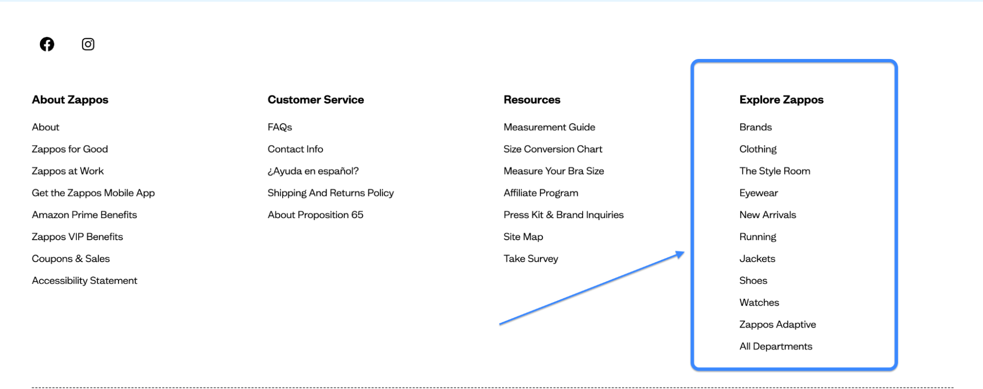
Running an ecommerce or SaaS site? This footer is your best friend. It highlights product categories, features, or support links so your visitors don’t feel lost.
Even after they’ve scrolled to the bottom, they’ll find quick access to what they need—whether it’s tracking an order or exploring your top sellers. Check out Zappos or Notion to see how it’s done.
5. Legalese Footer
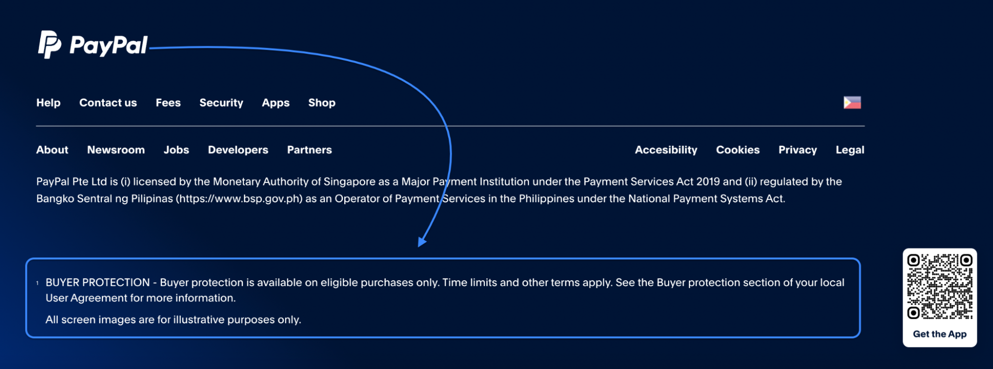
Okay, it’s not the flashiest, but this footer builds serious trust. A legalese footer is packed with privacy policies, terms, disclaimers, and sometimes cookie notices – especially important if your site collects data. You might also see contact details or accessibility info.
It shows you’re professional, compliant, and transparent. Take a look at Stripe or PayPal to see how it’s handled with style.
6. Site Index Footer
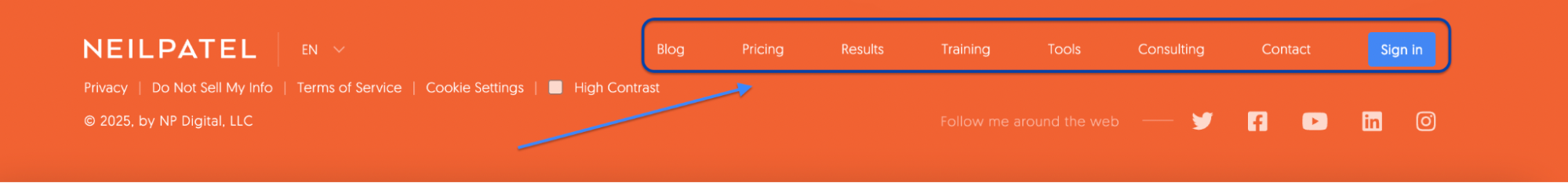
Think of this like a mini-map for your website. It lays out all your major footer links in one neat section. It is super helpful for users and great for SEO, too.
It’s ideal for content-heavy websites that want to give visitors more paths to explore. Even better, it keeps bounce rates low because people actually click on what they see. Check out Moz or Neil Patel to see this in action.
7. No Footer
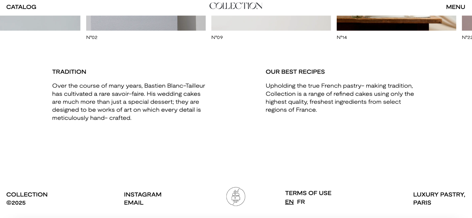
Yup, some sites skip the footer entirely. It’s rare, but for ultra-minimalist or artsy websites, it can make sense – just a clean finish with no extra content.
It creates an immersive vibe, but just know you’ll sacrifice some usability and SEO perks. Still, it’s bold and intentional. Apple’s AirPods Pro page and award-winning sites on Collection pull it off beautifully.
Key Elements Every Website Footer Should Include
A good-looking website footer isn’t just decoration – it’s a utility hub. When a user scrolls all the way down, they’re usually hunting for something: a phone number, a policy, or maybe even a last-minute offer.
A clever footer design anticipates those user journeys and delivers relevant information right where they need it. Not only does this boost UX, but it also helps search engines understand the structure of your site’s content. Let’s break down the essential building blocks of a footer that’s both functional and visually appealing:
Copyright Notice
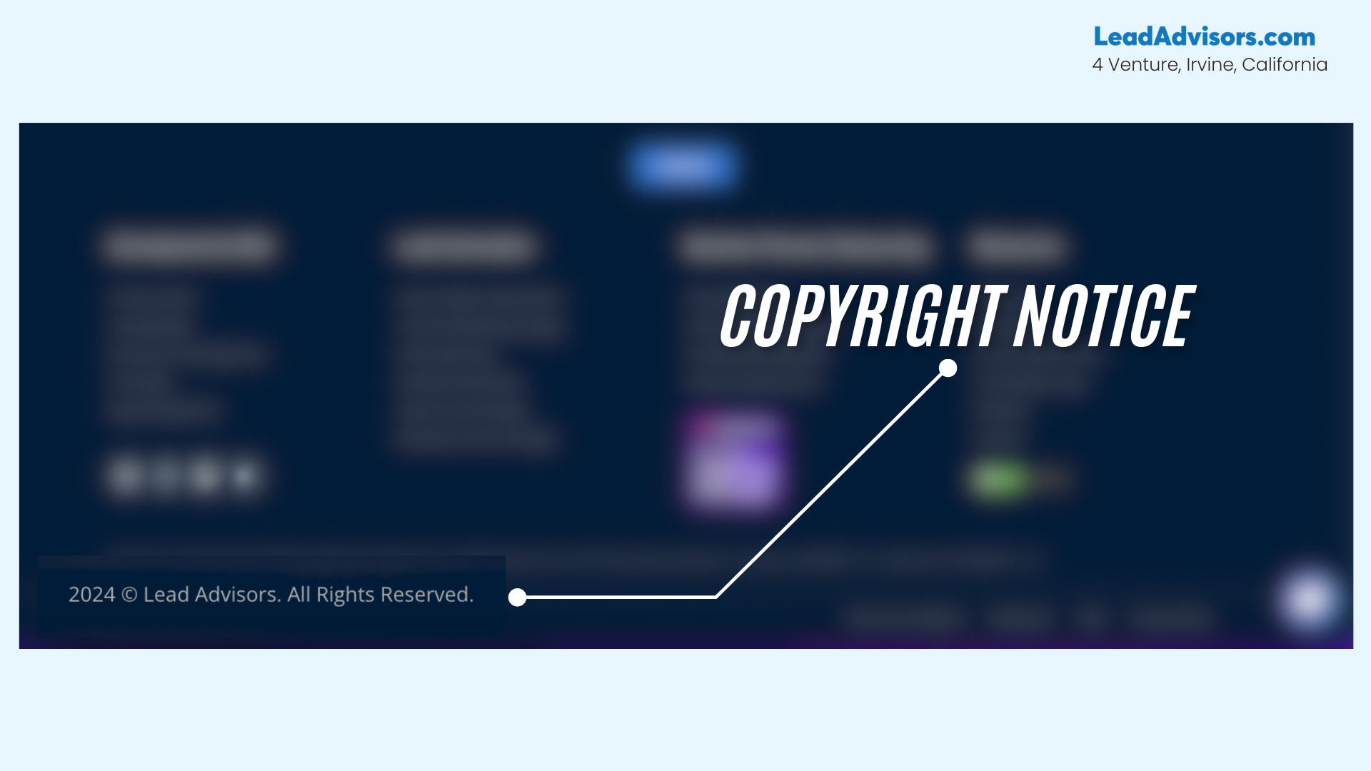
Let people know who owns the content and when it was last updated. This small touch helps build trust and shows you’re on top of your game. Plus, it adds legal clarity without taking up much negative space.
Typically, this goes in tiny text at the very bottom. Bonus: update the year dynamically so it never looks outdated.
Privacy Policy & Terms of Use
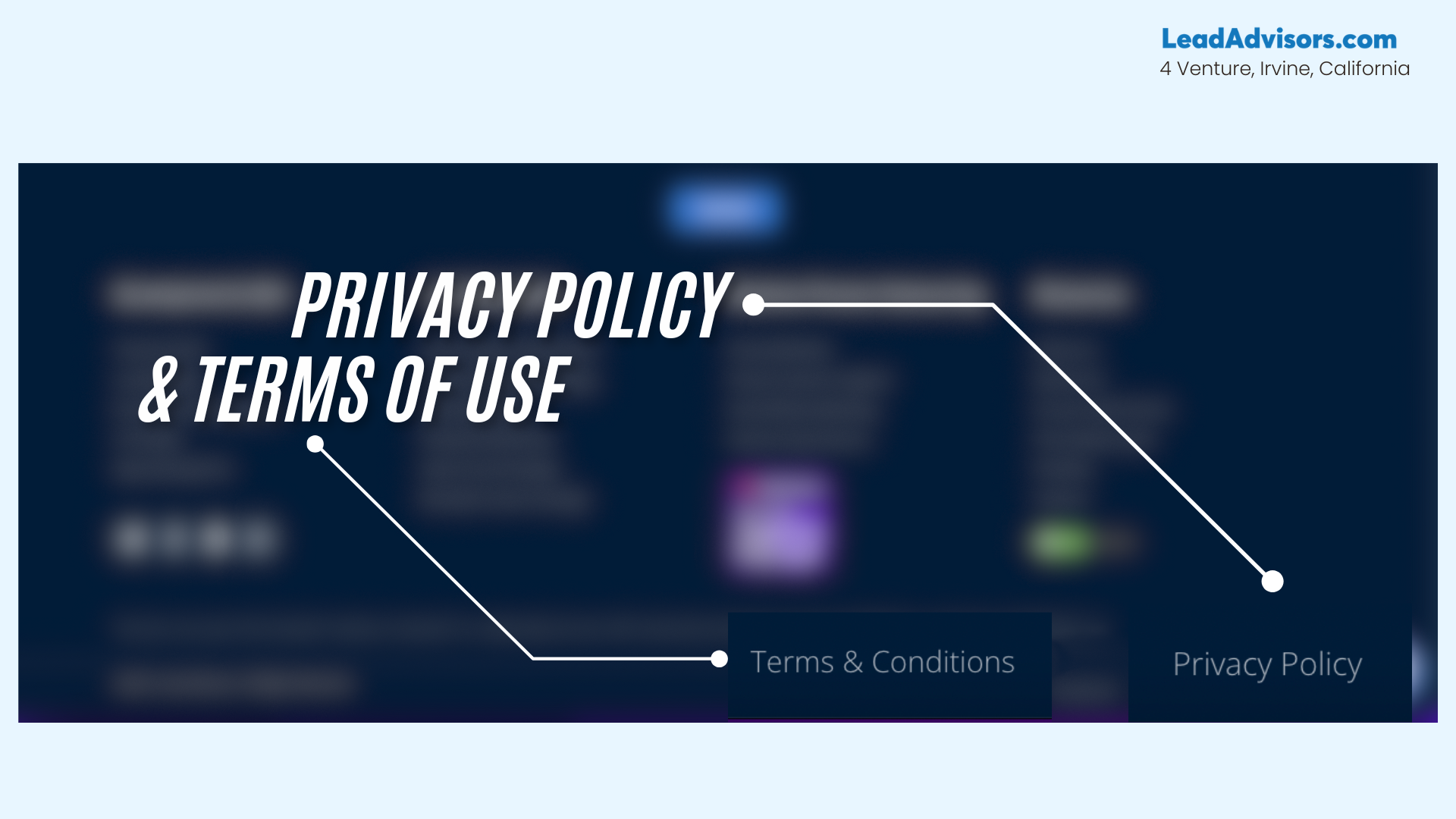
This one’s a must-have – especially for businesses that collect emails or run ads. These footer links let users access important legal documents while signaling transparency to visitors and search engines.
You don’t have to make them flashy, but they should always be easy to find. These pages also support compliance with laws like GDPR and CCPA. Place them alongside your copyright or trust badges.
Contact Information
Make it easy for people to reach you – don’t hide your contact information in a maze of links. Include an email, phone number, or even a physical address if relevant.
Clear contact details show you’re legit and make users feel more confident about engaging with your brand. It’s especially useful for service-based businesses and local SEO. When users find your info fast, they’re more likely to convert.
Social Media Icons
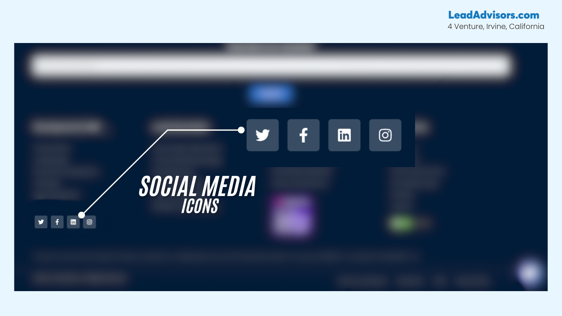
These tiny icons can carry a lot of weight. Your footer is a great spot to place social media links without disrupting your main content.
They give visitors one more way to connect and stay in the loop with your brand. Keep them subtle, consistent in design, and always make sure they open in a new tab. Whether it’s Instagram, LinkedIn, or TikTok – link up where your audience hangs out.
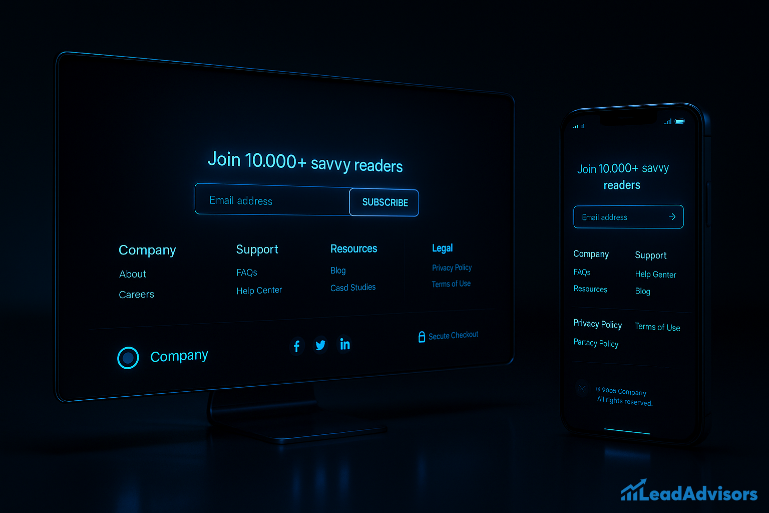
Email Newsletter Sign-up
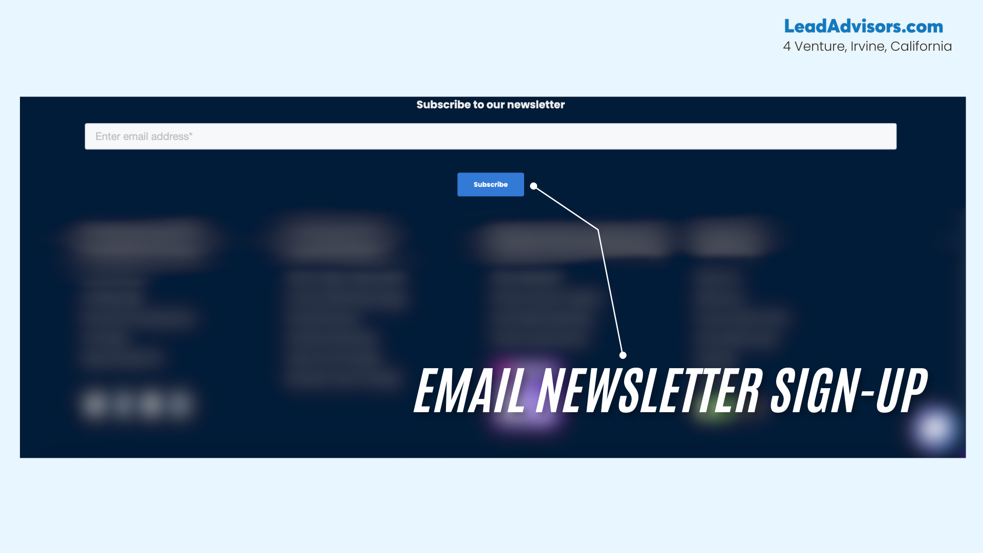
Looking to grow your list? Tuck an email signup field in your footer with a short, friendly message. This allows you to collect leads from people already interested in your site’s content.
It’s low-pressure and doesn’t take up much room – just be sure it’s mobile-friendly. A killer incentive (like a discount or exclusive guide) can boost conversions.
Logo & Branding Elements
Your ‘voice’ should come through, even in your footer. Upload your logo, match your color scheme, and perhaps strive for a tagline or mission statement.
This reinforces recognition and makes your footer visually appealing without overloading it. It also gives the whole page a polished, professional feel. Consistency is key – think of it as your brand’s signature at the end of a scroll.
Navigation Links / Sitemap
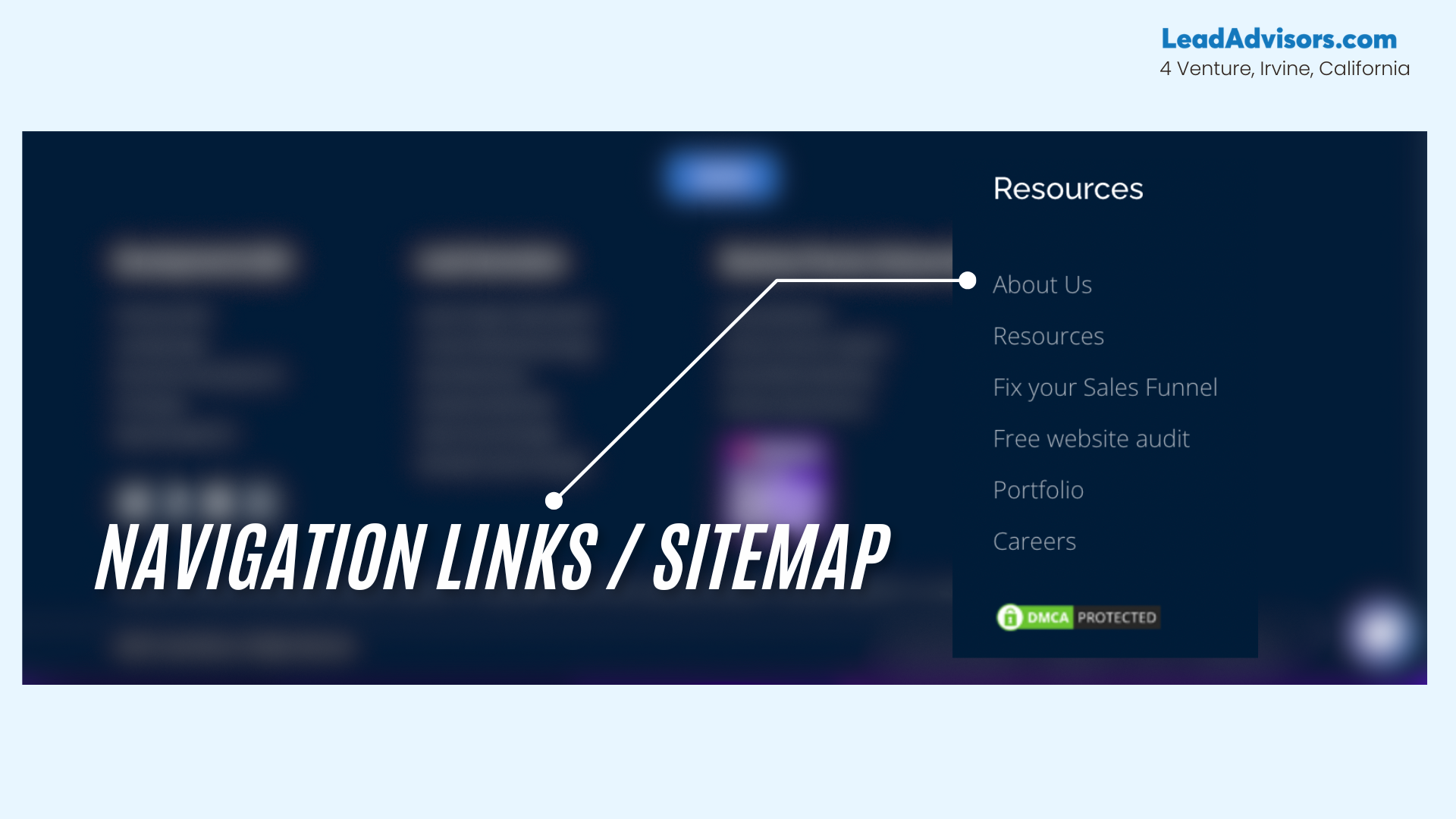
Help users (and search engines) navigate with ease. Include links to high-traffic pages like “About Us,” “FAQs,” or “Contact.” For bigger sites, consider grouping links into categories to keep things clean and organized. This kind of footer ensures better crawlability and a smoother browsing experience. It’s one of the easiest ways to keep people on your site longer.
Trust Badges or Certifications

If you’ve got ‘em, flaunt ‘em. Security logos, verified certifications, awards, or affiliations add social proof and boost credibility. These small graphics can make a huge impact on visitors who are deciding whether to trust your brand. Just keep them tidy and not too flashy.
The footer is the perfect place to showcase your legitimacy without disrupting your content flow.
SEO Best Practices for Footer Design
| Best Practice | What It Means | Why It Matters |
| Smart Internal Linking | Add links to high-priority pages (e.g., About, Services, Blog, Contact) in your footer. | Helps users and search engines navigate your site’s content easily and distributes link equity. |
| Descriptive Anchor Text | Use keyword-rich labels like “Explore SEO Services” instead of “Click here.” | Makes your footer links clearer for users and improves crawlability and context for search engines. |
| Minimize External Links | Avoid excessive outbound links; if needed, use rel=”nofollow” on them. | Keeps your site’s authority intact and avoids diluting SEO power. |
| Add a Sitemap Link | Include a visible HTML sitemap link (not just an XML one) in your website footer. | Offers a user-friendly map of your web page structure and improves site crawlability. |
| Support, Don’t Spam | Keep your footer clean, visually appealing, and aligned with your brand. Don’t stuff it with irrelevant keywords or links. | A balanced footer design boosts trust, user flow, and helps, not harms, your SEO efforts. |
How to Design a High-Converting Footer (Step-by-Step Guide)
Think of your website footer as the closing statement of your entire online experience. Done right, it leaves visitors with clarity, trust, and even a final nudge toward conversion. Whether you run a sleek SaaS startup, an editorial site with many pages, or one of those highly visual lifestyle brands, your footer deserves as much strategy as your hero section.
Here’s how to build a good footer that converts – step by step – with SEO in mind and usability at heart.
Step 1: Map Out a Logical Structure
Before you even think about color or fonts, focus on your information architecture. That means grouping footer links into logical sections such as:
- Company (About, Careers)
- Support (FAQs, Help Center)
- Resources (Blog, Case Studies)
- Legal (Privacy Policy, Terms of Use)
When visitors reach the bottom of your web page, they’re looking for easy access to essentials, not a cluttered mess. Use columns, consistent headings, and clear categories to reduce friction. The best examples – like Apple, Slack, or Shopify – make their footers feel intuitive because they’re structured, not stuffed.
Step 2: Limit Clutter and Prioritize High-Value Links
You might be tempted to add everything to your footer, but less is more. Aim for 5–10 strategic links that align with user needs and SEO. Prioritize pages like “Contact,” “Pricing,” or “Our Services,” rather than every blog post or case study.
Too much clutter can overwhelm users, especially on sites with many pages. Think of your footer design as a mini control center, not a junk drawer. Keep it lean, clean, and laser-focused.
Step 3: Include a Strong Call-to-Action (CTA)
Once someone scrolls all the way down, they’ve shown interest – don’t miss the opportunity to engage them further. This is where a clear CTA, like a newsletter signup box, shines. Invite them to subscribe with a value-driven message, like “Get weekly marketing tips in your inbox” or “Join 10,000+ savvy readers.”
Use contrasting buttons, short forms, and friendly copy to make the action inviting. The best examples from brands like Mailchimp or Buffer make it feel like a personal invitation, not a hard sell.
Step 4: Design for Visual Harmony and Readability
Your footer’s layout should align with your brand’s visual identity. Use consistent fonts, brand colors, and white space (aka negative space) to give everything breathing room. Icons for social media links, links for contact details, and your newsletter signup should feel like part of one cohesive design.
If your footer feels crammed or chaotic, it can erode trust. A visually appealing layout gives users a sense of calm and control, and supports better scanning for both people and search engines.
Step 5: Don’t Forget Mobile Optimization
Over half of your visitors are probably viewing your site on a phone or tablet, so your footer content has to be mobile-friendly. That means stacked layouts, tap-friendly links, and legible fonts. Avoid stuffing too many columns that don’t translate well to smaller screens.
A mobile-optimized website footer ensures users don’t drop off right before they are about to take action. Test your design on multiple devices to catch hidden UX issues.
Step 6: Reinforce Your Brand and Build Trust
End with a flourish by inserting some brand identity. Include your logo, tagline, or a short statement about your business. A copyrighted notice is another must – it lets them know you’re current and official.
If applicable, include trust badges, secure payment logos, or certification seals. These subtle details can influence conversions, especially for new visitors. Remember: a good footer builds credibility while keeping things simple.
Real-World Footer Design Examples (With Takeaways)
Need a little inspiration before you dive into your footer redesign? Here are some of the best examples of smart, stylish, and conversion-driven website footer designs. Each one showcases a unique strength-from usability to branding-and includes a quick takeaway you can apply to your site.
Cartier — Accessibility Meets Luxury Branding
Cartier’s footer is the definition of elegant structure. It provides easy access to customer care, services, and store locator tools while keeping the luxurious aesthetic intact. The footer links are presented with ample negative space, clean typography, and global language options.
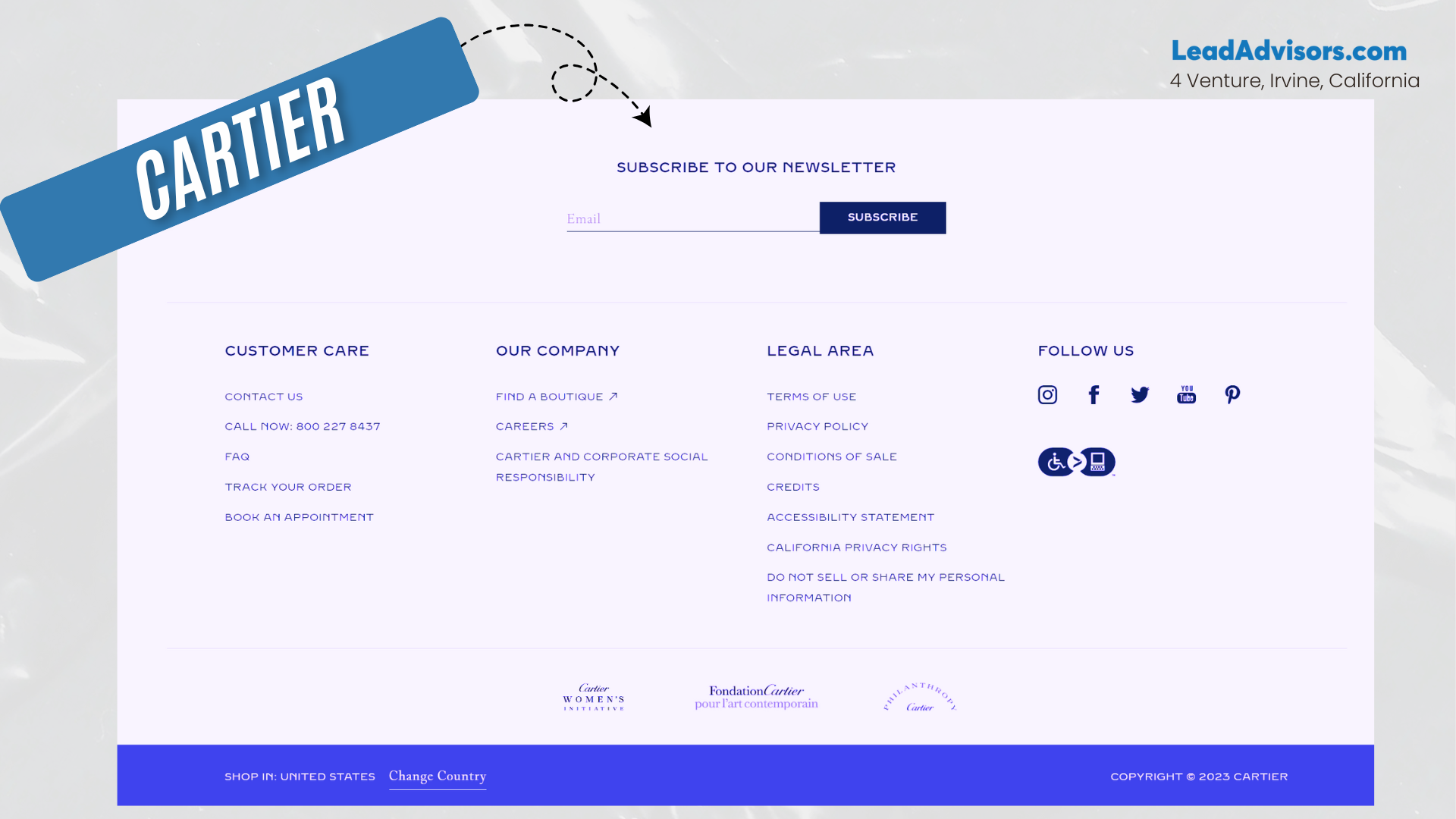
The copyright notice, policies, and contact options are subtly placed, respecting both form and function.
Takeaway: Accessibility doesn’t have to compromise branding – your footer design can be inclusive and premium.
Loungefly — A Clean, Structured Fat Footer
Loungefly uses a fat footer with clearly grouped links under “Company,” “Help,” and “Extras.” The design is tidy, with generous spacing and bold headers that guide users naturally. Their newsletter signup is integrated seamlessly without feeling forced.
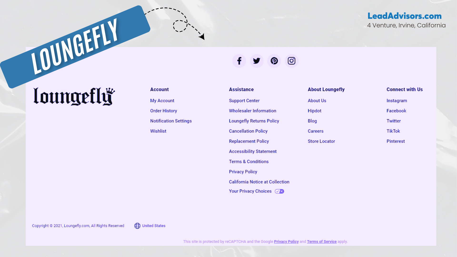
Add to that colorful accents that reflect their playful lifestyle brand identity, and you’ve got a footer that feels both functional and fun.
Takeaway: Even with many pages, a clean structure makes navigation a breeze.
Target — Icons That Do the Talking
Target’s website footer stands out with its use of intuitive icons alongside footer links like Returns, Gift Cards, and Order Tracking. This adds a layer of visual scanning that enhances UX, especially for mobile users.
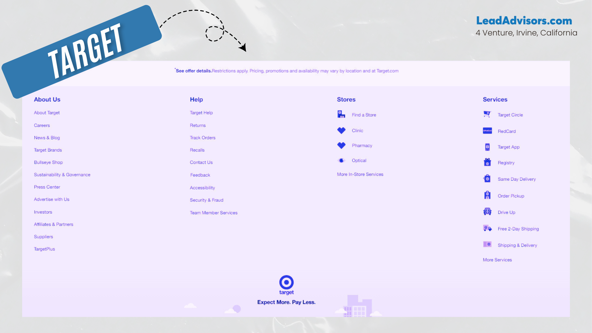
Their design balances information architecture with customer convenience. Add in clear legal and contact information, and it’s a masterclass in big-brand design.
Takeaway: Add visual cues to make footer content more scannable and engaging.
Wild — Bold CTA-First Footer
Wild (the natural deodorant brand) goes bold with a footer design that starts with a bright, centered newsletter signup. It’s the first thing you see when you scroll down—paired with cheeky, on-brand copy.
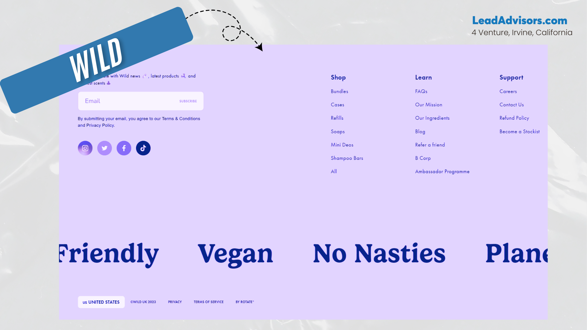
The design strips away clutter and focuses entirely on driving one conversion goal. It’s sleek, mobile-friendly, and totally aligned with their voice.
Takeaway: Don’t be afraid to lead with your CTA if list-building is a core goal.
Marvel — Seamless Cross-Service Navigation
Marvel’s footer is stacked with internal links that span everything from comics to merchandise to games and streaming. The layout mirrors their expansive brand universe, making it easier to jump between services.
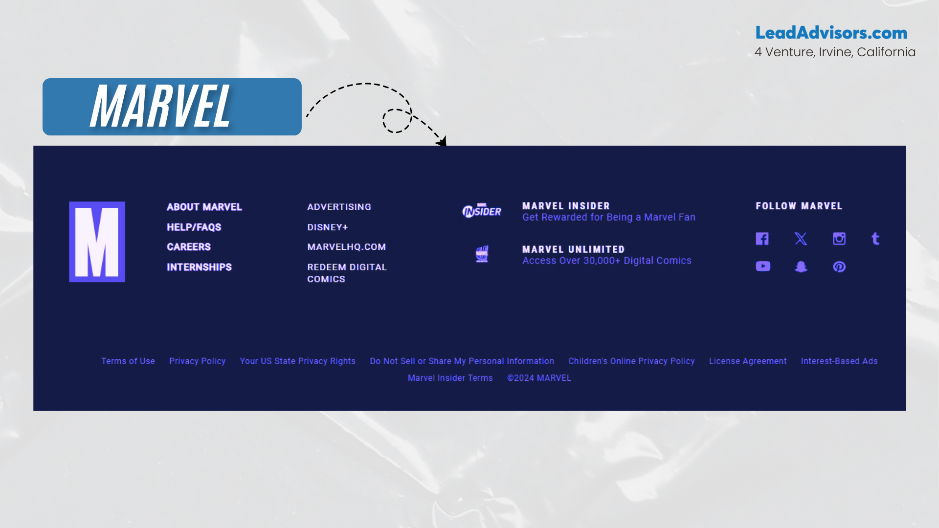
Their footer ensures continuity across platforms while staying true to their graphic style. The red-and-black palette, combined with descriptive anchor text, reinforces their identity with every link.
Takeaway: If your brand has multiple verticals, your footer can act as a cross-service hub.
Mangools — Trust, Proof, and Social Presence
Mangools’ footer nails the trifecta: trust badges, customer testimonials, and social media links – all wrapped in a clean SaaS aesthetic. There’s a strong focus on trust-building without overwhelming the layout.
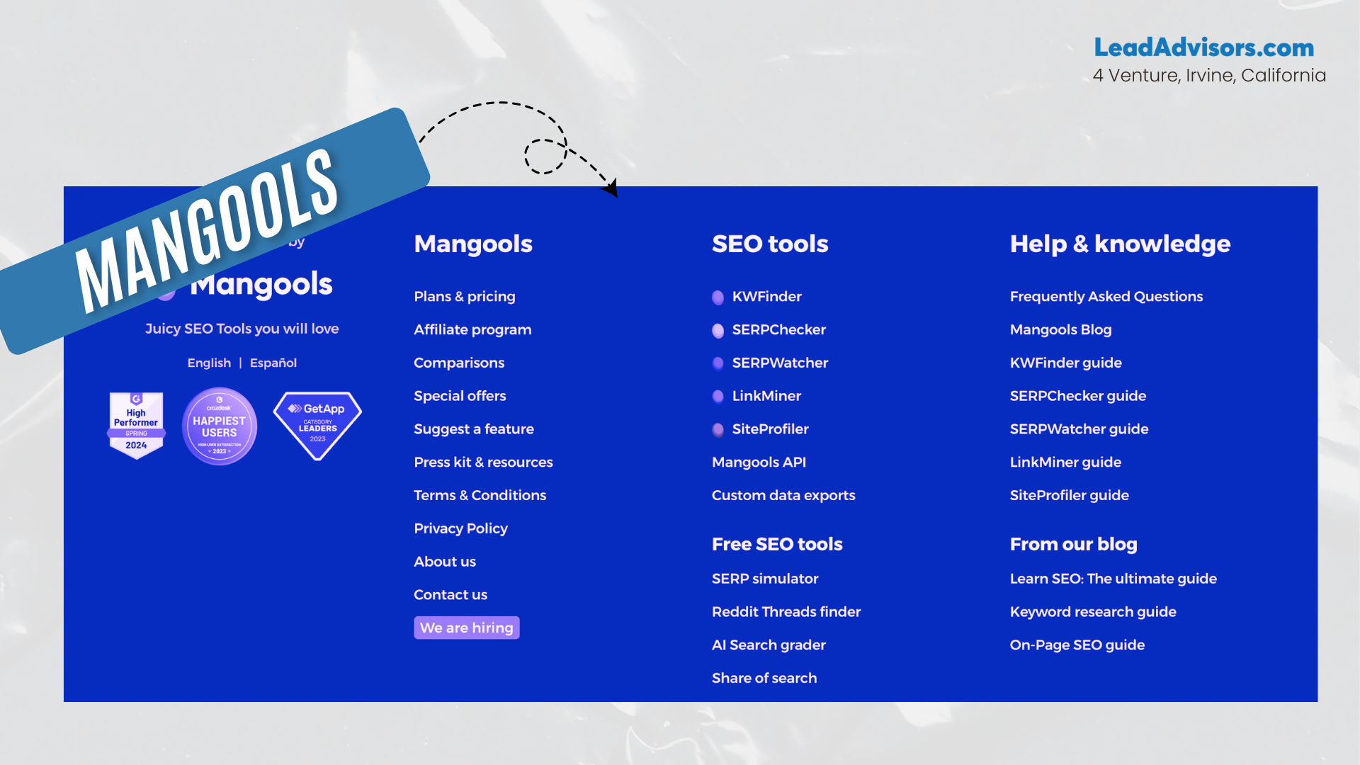
They also use clever microcopy under their newsletter signup to boost opt-ins. Even their legal links are styled with UX in mind.
Takeaway: Use your footer design to reinforce credibility and drive conversions at the same time.
Tāmras Gin — Illustration-Led Emotional Branding
Tāmras Gin takes a different route by using custom illustrations and poetic copy in its footer. It’s a storytelling moment that wraps up the scroll journey on an emotional note.
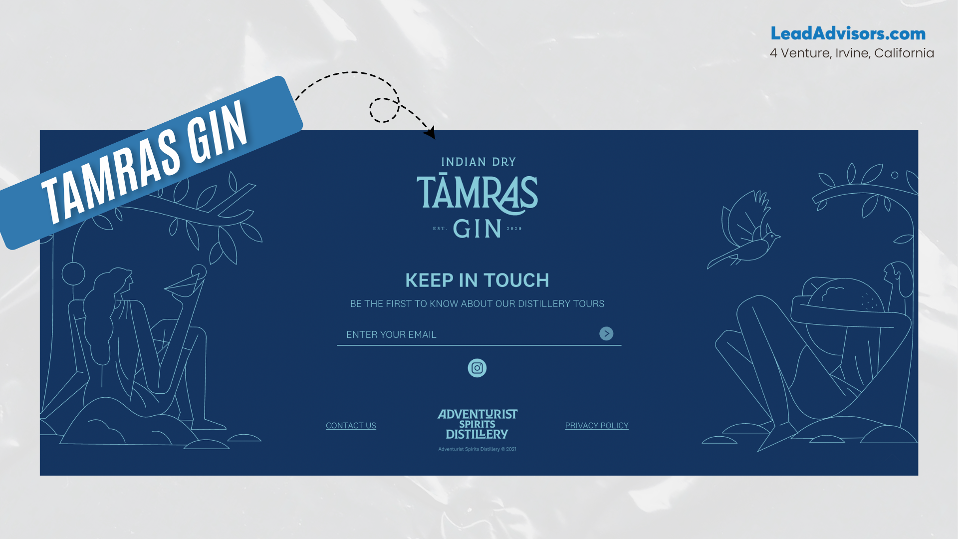
There are minimal links, but every element aligns with their artisanal, heritage-driven aesthetic. The footer content flawlessly blends design and mood.
Takeaway: For artistic or lifestyle brands, your footer can serve as an emotional signature, not just a utility bar.
Common Footer Mistakes to Avoid (And How to Fix Them)
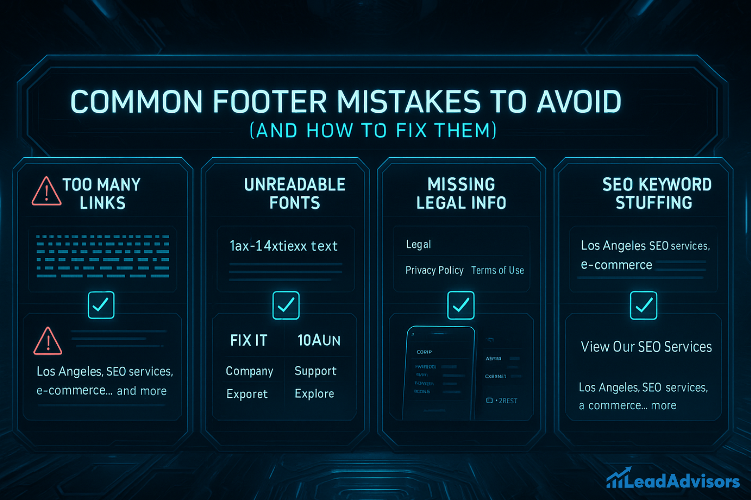
Your website footer might be the very last section your visitor sees, but it’s far from unimportant. A cluttered, broken, or outdated footer can quietly erode user trust, confuse search engines, and create friction in the user journey. Below are the most common mistakes we see in footer design, and exactly what you can do to avoid them.
Mistake 1: Overcrowding Your Footer With Too Many Links
The Problem: Some brands treat the footer like a sitemap and try to cram in every single page, especially if their site has many pages. The result? An overwhelming wall of links that nobody wants to scroll through. This clutters your information architecture, confuses the user, and can dilute your internal linking strategy.
How to Fix It:
- Prioritize 5–10 core footer links that reflect your site’s key actions: Contact, About, Services, Blog, Careers.
- Organize them into labeled groups (e.g., “Support,” “Company,” “Explore”) for easy access.
- Check out the best examples of brands like Shopify or Loungefly, which structure their fat footers into neat, browsable sections.
Mistake 2: Hard-to-Read Footer Fonts
Your footer might be packed with helpful content, but if it’s set in 10px light gray text on a dark background, no one will read it. Small or low-contrast fonts reduce usability and kill mobile readability. Plus, they raise a red flag for accessibility standards.
How to Fix It:
- Use a font size of at least 14px for body text in your footer content.
- Ensure there’s enough negative space between sections, links, and columns.
- Stick to your brand fonts but increase contrast to maintain visual balance.
- Test on both light and dark backgrounds to see what works best across devices.
Mistake 3: Missing Legal Essentials
No privacy policy, no terms of use, and no copyright notice? That’s a recipe for distrust. It also sets off alarms for users who value data privacy and may even violate compliance regulations depending on your industry.
How to Fix It:
- Add a dedicated column in your footer labeled “Legal” or “Privacy.”
- Include your Privacy Policy, Terms of Use, and cookie settings if applicable.
- Don’t forget to include a current copyright notice – bonus points if it’s dynamic and updates yearly.
- These subtle inclusions go a long way in improving trust and brand professionalism.
Mistake 4: Footer Isn’t Mobile Responsive
Your footer design may look great on desktop, but fall apart on smaller screens. On mobile, cramped columns, tiny tap areas, and unreadable text create friction that can make users bounce before taking action.
How to Fix It:
- Use a stacked, single-column layout for mobile – don’t squeeze five columns side by side.
- Make sure social media links and contact information are tap-friendly.
- Use padding to prevent crowding, and test the layout on real devices, not just desktop emulators.
- A mobile-optimized website footer creates a smoother online experience and keeps visitors engaged longer.
Mistake 5: Keyword Stuffing for SEO
Adding a block of repetitive, keyword-stuffed phrases like “Los Angeles SEO services, digital marketing, e-commerce, local search” might seem smart, but it’s not. Modern search engines prioritize user-friendly, readable content over keyword-dense spam.
How to Fix It:
- Use descriptive anchor text for internal links (e.g., “View Our SEO Services” vs “Click Here”).
- Link only to relevant pages that naturally support the user journey.
- Incorporate 1–2 focus keywords naturally in link text or CTA copy, but skip the keyword salad.
- Focus on adding value for humans first – Google will follow.
Pro Tip: A Good Footer Does Three Things Well
- It provides easy access to the most useful pages.
- It reflects your brand identity in design and tone.
- It ends the page with trust, clarity, and confidence.