User experience (UX) design can influence how users perceive and interact with digital platforms. Poor UX design frustrates users, discourages user engagement, and damages a brand’s reputation. When you ignore user feedback and fail to adapt to mobile users’ needs, you risk alienating your audience.
In this article, we’ll explore 7 bad UX design examples, why they fail, and how to avoid these UX design mistakes.
What is Bad UX and Why Does It Matter?
Bad UX examples arise when digital platforms fail to align with users’ expectations, which frustrates and discourages engagement. Whether it’s a user interface that feels cluttered or unclear instructions that leave them guessing, poor design prevents them from smoothly navigating a platform and achieving their goals.
Aside from frustrating users, a negative user experience damages a brand’s reputation. When users encounter barriers like complicated workflows or inaccessible designs, they’re less likely to return, and their dissatisfaction may deter potential new users.
You can avoid these pitfalls by analyzing user behavior and focusing on improving the user’s flow. A well-thought-out design addresses current frustrations and encourages users to interact with confidence and satisfaction.
Here are a few examples of bad UX design and actionable steps to enhance user satisfaction and user flow:
1. Overcrowded Interfaces: The “Where Do I Start?” Syndrome

When users struggle to find what they need due to excessive elements, it creates a disorienting user experience. An overcrowded user interface lacks intuitive navigation and often frustrates users, leaving them unsure of where to click.
The website LingsCars.com is a prime bad UX example. With its flashing animations, cluttered interface, and countless links, it forces users to wade through a sea of distractions. This classic case of poor UI design confuses users and fails to meet their expectations.
How to Fix:
Simplify by prioritizing essential tools and key features.
Use visual hierarchy to guide the user’s eye – from header elements to thoughtful footer design that supports site navigation without clutter.
Leverage white space strategically to reduce clutter and create breathing room.
Conduct rigorous user research to understand how users interact with the interface and where they face challenges.
2. Poorly Designed Forms: Asking for Too Much
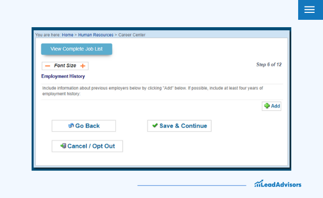
Unnecessarily complicated forms disrupt the user experience and kill conversions. A well-optimized contact form balances simplicity with effectiveness. Asking for excessive, irrelevant, or redundant details overwhelms users, especially those unfamiliar with the process, and creates a poor UX.
One of the most notable examples of bad UX design is the overly detailed online job application process. Research indicates that more than half of users (67%) abandon applications because of their length or complexity. Similarly, mobile users, who often face additional challenges like smaller screens and slower load times, are even more likely to quit due to frustratingly complicated forms.
How to Fix:
Only request essential features like name, contact information, and resume.
Indicate optional fields to set clear user expectations.
Implement autofill and progress bars to enhance user interaction.
3. Non-Responsive Design: A Desktop-Only Dinosaur

With the majority of web traffic coming from mobile devices, non-responsive websites alienate both new users and experienced users. This also discourages engagement, which makes it a costly UX design fail to avoid.
The online marketplace Arngren.net features a cluttered layout with numerous images and text, making navigation challenging for both desktop and mobile devices. Its lack of responsiveness leads to poor user experience, especially on smaller screens.
How to Fix:
Track user behavior to understand which devices your audience uses most frequently.
Use a mobile-first design approach to prioritize usability for smaller screens.
Test the website across various screen sizes through rigorous user testing to ensure accessibility and functionality.
Leverage responsive design frameworks to create adaptable and user-friendly interfaces.
4. Accessibility Barriers: Leaving Users Behind

Lacking adequate accessibility features creates usability issues for users with disabilities. Excluding them may lead to a poor UX design experience and legal repercussions.
A perfect bad UX example is Domino’s Pizza, which faced legal scrutiny after a blind customer filed a lawsuit because the website and app were not accessible for users relying on screen readers. The case, which reached the U.S. Supreme Court in 2019, highlighted the challenges users with disabilities face when businesses fail to meet digital accessibility standards.
How to Fix:
Provide alt text for icons and images to aid screen readers.
Use clear, concise labels and instructions for all interactive elements to avoid user confusion.
Adhere to WCAG 2.1 guidelines to address accessibility needs and meet user expectations.
5. Misleading Buttons and Links: Broken Promises

Websites with deceptive “Download” buttons or misleading links that redirect users to irrelevant pages are also classic examples of bad UX. These practices frustrate and confuse users and significantly erode trust.
When you click a button expecting a specific action – accessing a particular page – but are instead redirected to ads or irrelevant content, the experience feels dishonest and disorienting. Such a poor UX design failure can be found in most file-sharing websites, where overly aggressive monetization tactics take priority over user experience.
How to Fix:
Label buttons clearly and honestly to meet user needs.
Ensure links behave as intended through rigorous usability tests and user research.
Prioritize a seamless and transparent user experience by avoiding cluttered layouts and misleading visual cues.
Test the interface with new users to understand potential frustrations and fine-tune the complicated user flows accordingly.
6. Slow Load Times: Patience Has Its Limits
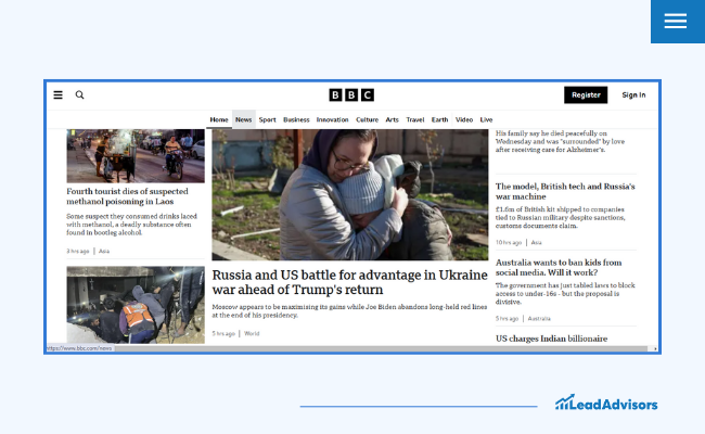
Slow page transitions annoy users and deter them from exploring the site, negatively impacting revenue and user satisfaction. A Kissmetrics study on users’ expectations shows that pages must load in under three seconds. Exceeding this threshold can lead to higher bounce rates and decreased engagement.
For instance, in 2023, the BBC reported losing 10% more users for every extra second their site took to load.
How to Fix:
Optimize images and videos for faster loading.
Use lazy loading for secondary content.
Implement a content delivery network (CDN) to enhance performance for global audiences.
Regularly analyze your platform’s speed through user testing, identifying bottlenecks and addressing them promptly.
7. Unclear Navigation: Lost and Confused Users
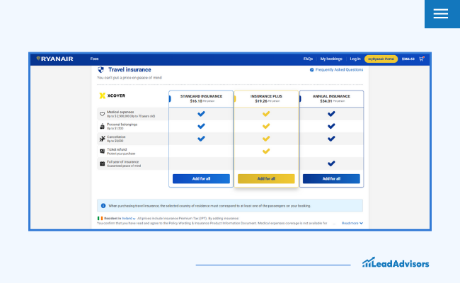
Confusing navigation forces users to abandon the platform. This leads to lower engagement and user frustration.
The Ryanair website is a classic case of confusing layout and navigation. Users struggled with its hidden fees and poorly structured interface, which failed to prioritize key features. This resulted in countless frustrated users and an overall perception of poor usability.
How to Fix:
Stick to intuitive navigation patterns with visible labels to help users find information easily.
Use icons paired with descriptive text to guide users more effectively.
Incorporate a search bar for quick access to key information.
Conduct regular tests to ensure user-friendly interfaces.
Note: The examples provided are based on publicly available critiques and are intended for educational purposes.
How to Identify and Avoid Bad UX Design: Using User Feedback and Behavior
Spotting bad UX doesn’t have to be overly technical. Here are a few simple steps to help you catch and fix common UX pitfalls:
Pay attention to user behavior to see where people might be getting stuck or frustrated.
Gather user feedback by asking your audience what works and what doesn’t – or follow a structured user feedback analysis approach to uncover deeper usability issues.
Look at key metrics, including:
Bounce rates (how quickly people leave your site).
Abandoned carts (if users don’t complete their purchases).
Slow page transitions (pages that take too long to load).
Test your site with real people using proven usability testing methods to identify and resolve friction points.
Make sure your design matches what users need and expect by keeping things clear and easy to use.
By focusing on these areas, you’ll make it easier for people to navigate your site and avoid common bad UX mistakes.
Why is User Experience Important in Web Design?
A seamless user experience builds trust and satisfaction – especially when rooted in data-driven user personas that reflect real audience behavior. When users interact with a well-designed platform, they feel valued and understood. Poor UX design, however, can overwhelm users, lead to abandonment, and damage a brand’s reputation.
UX design isn’t just about aesthetics – it’s about meeting user needs, simplifying interactions, and fostering a positive, efficient experience across all devices. Investing in user feedback and research is essential to prevent bad UX examples and ensure a platform that gets a user’s attention.
Frequently Asked Questions
What is an example of bad UX design?
A cluttered website with excessive ads is a classic bad UX example.
How do you identify bad UX design?
Analyze user interactions, monitor complaints, and conduct usability tests.
What are the consequences of bad UX design?
Lost revenue, diminished trust, and reduced user retention.
Final Thoughts: Avoiding UX Design Fails Through User Testing
Every bad UX design example offers an opportunity to learn. By prioritizing clarity, accessibility, and user-friendly design, businesses can transform poor UX into a competitive advantage.
At LeadAdvisors, we specialize in identifying and fixing UX design fails. Contact us today to boost user engagement and enhance your digital presence.


