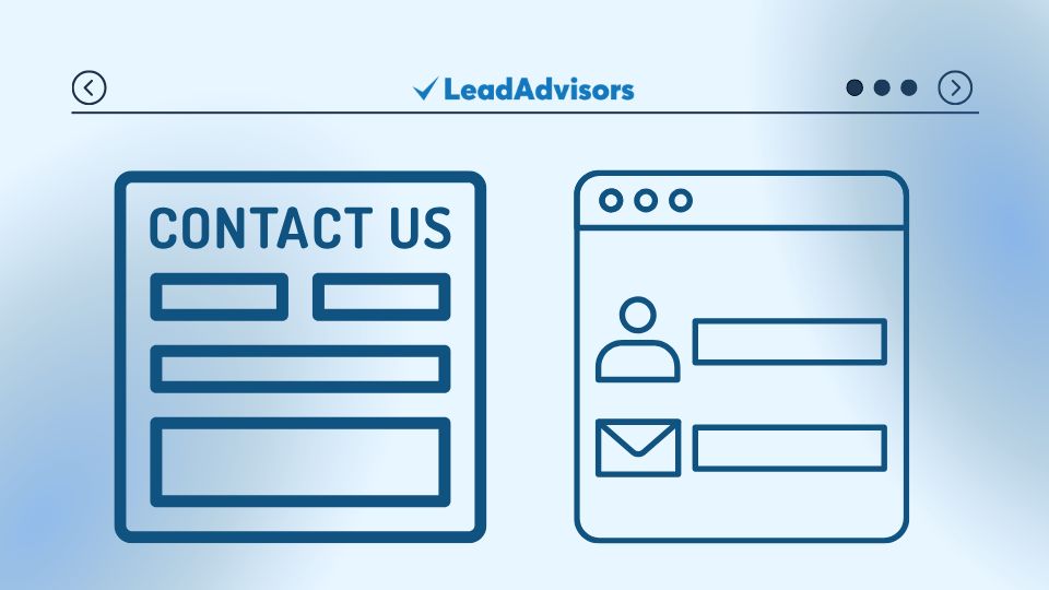
A contact form is one of the most crucial yet often overlooked elements when you optimize a website. Acting as a bridge between your visitors and your brand, it offers a direct way for users to engage and provide valuable information.
However, poorly designed contact forms can deter visitors from submitting their details, resulting in missed opportunities. By focusing on iterative design and continuous improvement, leveraging user feedback analysis, and staying updated with the latest e-commerce trends, you can transform your contact forms into powerful tools for conversion funnel optimization. Ultimately, this drives better lead generation and conversions.
In this article, we’ll explore everything about optimizing contact forms for better conversions. We’ll discuss design best practices and provide actionable tips to enhance user experience. By following these strategies, you can improve your contact form’s effectiveness and boost lead generation.
What Is a Contact Form?
A contact form is a website feature that allows visitors to communicate directly with a business. It typically includes fields where users can enter details like name, email, phone number, and a message. For example, a digital marketing agency might use a contact form for free consultation requests or service inquiries.
This tool provides a convenient way for users to ask questions or request information without emailing directly. Additionally, contact forms help businesses capture leads, answer customer questions, and improve communication. Ultimately, they play a key role in supporting client relationships and gathering valuable user data.
Why Contact Form Optimization Matters
Form conversion happens when a visitor successfully submits a form on your website. This could be for signing up, downloading a resource, or requesting a service. A well-optimized form increases submission rates and generates high-quality leads. These leads are vital for business growth and success.
In fact, research shows that forms with fewer fields and clear calls-to-action (CTAs) have much higher conversion rates. According to CRO experts, a good form conversion rate typically falls between 2-5%, though optimized forms can go as high as 25% depending on their design and strategy.
10 Tips to Optimize Contact Forms for Conversions

Optimizing your contact forms is essential for improving lead generation and increasing conversions. By auditing a website and tailoring the form’s design, field selection, and user experience to specific user personas, you can create a seamless interaction that encourages more visitors to submit their information. Here are 10 actionable tips to help you maximize your contact form’s effectiveness.
Move Your Form Above the Fold
Placing your contact form above the fold ensures that visitors can immediately see it without needing to scroll. The more visible and accessible your form is, the more likely users are to engage with it. Placing it too low on the page might cause it to go unnoticed, reducing conversion potential.
A simple layout with minimal distractions and a clear form placed above the fold can drive more conversions.
Craft a Compelling Form Headline
Your form headline should double as a call-to-action (CTA) that clearly tells users what they’ll gain by filling out the form. Just as you would optimize a website’s title and tags to attract clicks, your form headline should be specific and enticing.
For example, avoid vague headlines like “Sign Up” and use something more compelling. Phrases such as “Get Your Free Guide Now!” or “Claim Your Discount Today!” are more effective. These clear headlines instantly show users the value they’ll receive, boosting conversion rates.
Limit the Number of Fields
When designing your contact form, remember that less is more. The fewer fields a user has to fill out, the more likely they are to complete the form. In contrast, adding too many fields can overwhelm visitors and increase abandonment rates.
Conducting a content gap analysis can help identify the essential information needed for conversion, ensuring your form collects only crucial details such as name, email, and perhaps one other key field based on your business needs. This approach streamlines the user experience while maximizing conversions.
Highlight Required Fields on the Contact Form

If some fields are absolutely necessary, make them clearly marked as required. Using an asterisk () next to the required fields is a common way to signal this. However, avoid overdoing it; only make the most crucial fields mandatory. Optional fields can be included but should be visually separated to avoid confusion.
For example, a B2B form might require information about job title or company size, while leaving optional fields for additional comments.
Use a Clear and Action-Oriented Submit Button
The text on your submit button plays a crucial role in conversion rates. Just as content promotion strategies focus on compelling users to take action, your submit button should use action-oriented phrases that align with the form’s purpose. Instead of generic text like “Submit,” opt for specific CTAs such as:
– “Download Your Free eBook”
– “Get My Free Trial”
– “Claim My Discount”
These phrases remind users of the value they’re receiving, making the final click more enticing and aligning with broader strategies to engage and convert.
Ensure Mobile Optimization
With more than 50% of internet traffic coming from mobile devices, it’s essential to design mobile-friendly contact forms. With mobile optimization, the layout should be easy to fill out on a smaller screen, and make sure all fields and buttons are touch-friendly. Shorter forms tend to perform better on mobile devices, as they require less scrolling and typing.
Avoid Asking Unnecessary Information for the Contact Form
Be mindful of the information you request in your form, much like how on-page SEO and technical SEO focus on optimizing relevant elements without overloading a page. Studies show that users are hesitant to share personal details like phone numbers or addresses unless absolutely necessary.
Asking for too much information can lead to form abandonment. In most cases, an email address and name are sufficient to start a conversation, allowing you to gather leads without overwhelming visitors, similar to keeping your SEO efforts streamlined and effective.
Run A/B Tests on Form Elements
You can also experiment with different field placements or test a multi-step form versus a single-page form to see what works best for your audience. Incorporating usability testing methods, such as A/B testing or heat mapping, can help identify which form layout provides the best user experience and highest conversion rates.
Moreover, test different variations of your form’s layout, color scheme, CTAs, and field length to see which version leads to higher conversions. For example, one company found that a red CTA button outperformed a green button by 21%.
This data-driven approach ensures your form is optimized for both usability and effectiveness.
Build Trust with a Privacy Policy
When asking for personal information, especially in today’s privacy-conscious world, it’s essential to align with user intent analysis by addressing privacy concerns directly. Include a clear privacy statement near the form to reassure users that their data is safe and won’t be shared or sold.
By linking to your privacy policy, you provide transparency, building trust with visitors and increasing the likelihood they will complete the form, as it aligns with their intent to safeguard their personal information.
Use Visual Cues and Progress Indicators
For longer forms, consider breaking them into multiple pages with a progress bar as part of your overall UX strategy. This approach makes the process feel more manageable and reduces the likelihood of abandonment, as users are more willing to complete forms when they know how much of the process is left.
Incorporating elements from user journey mapping, such as icons, arrows, or subtle animations, can further guide users through the form, creating a smoother experience and encouraging completion.
Frequently asked Questions
Why is optimizing a contact form important for lead generation?
How many fields should a contact form have?
What makes a good contact form CTA (call-to-action)?
How can I make my contact form mobile-friendly?
What builds trust on a contact form?
Conclusion
Optimizing contact forms is essential for increasing lead generation and conversions. By simplifying form fields, crafting strong CTAs, and ensuring mobile responsiveness, you create a seamless user experience that encourages submissions and captures high-quality leads.
Additionally, implementing A/B testing and building trust with clear privacy policies further enhances form effectiveness. For expert guidance on optimizing your contact forms and boosting conversions, reach out to LeadAdvisors for tailored strategies that drive results.

